Case study / Vessel
Energy, rebuilt as a daily ritual.
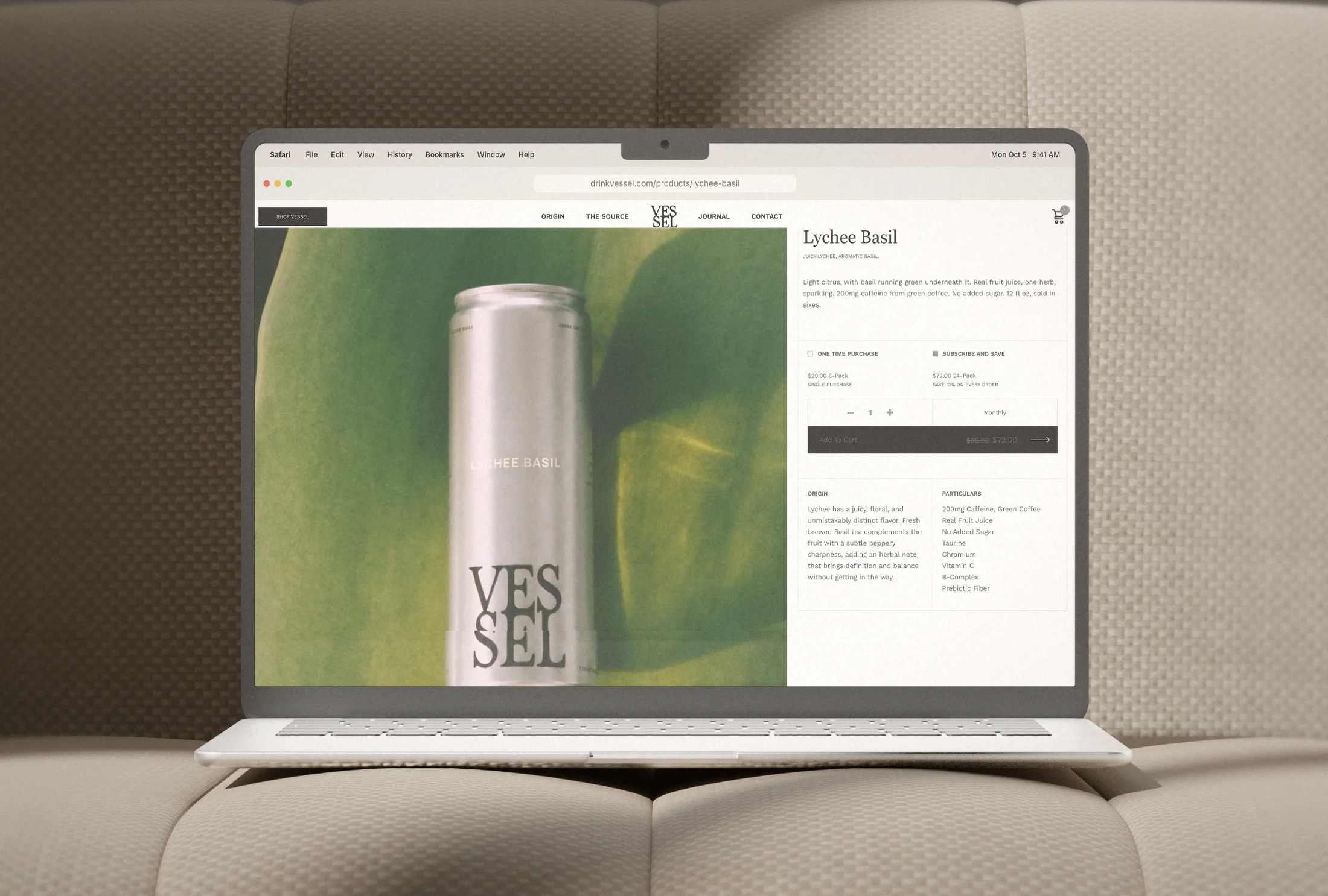
Product page, Lychee Basil.
Lychee Basil.
Passion Sage.
Yuzu Mint.
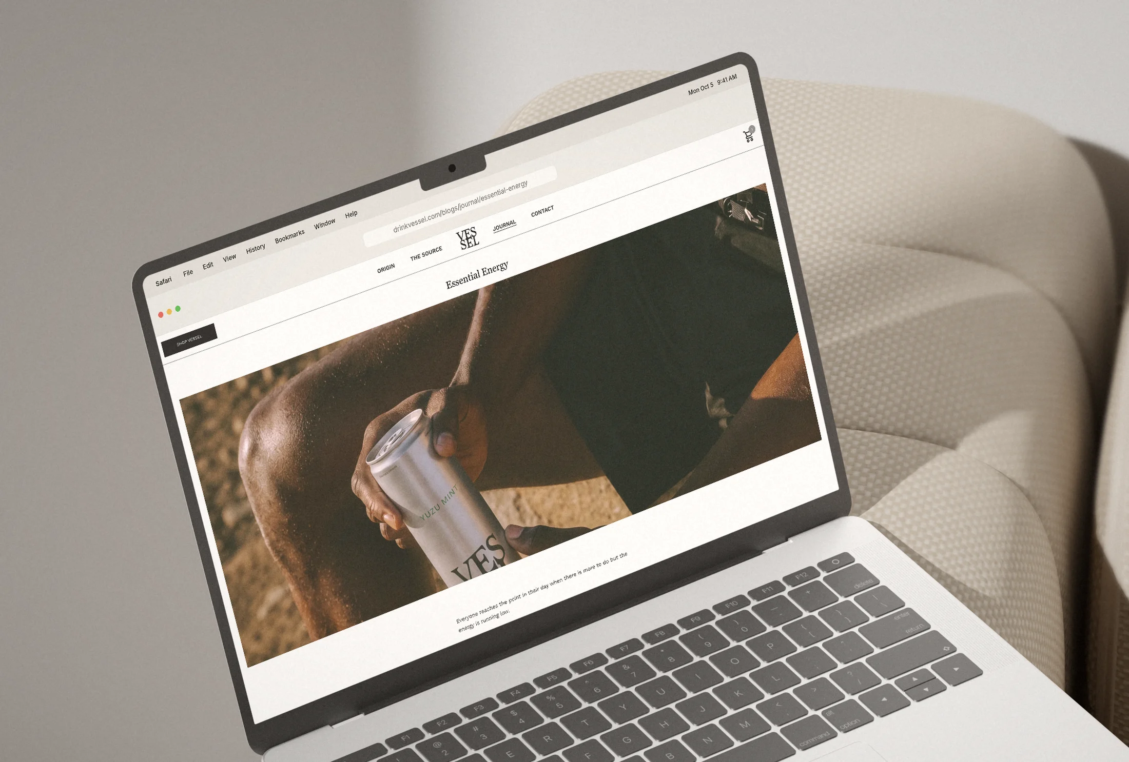
The Journal.
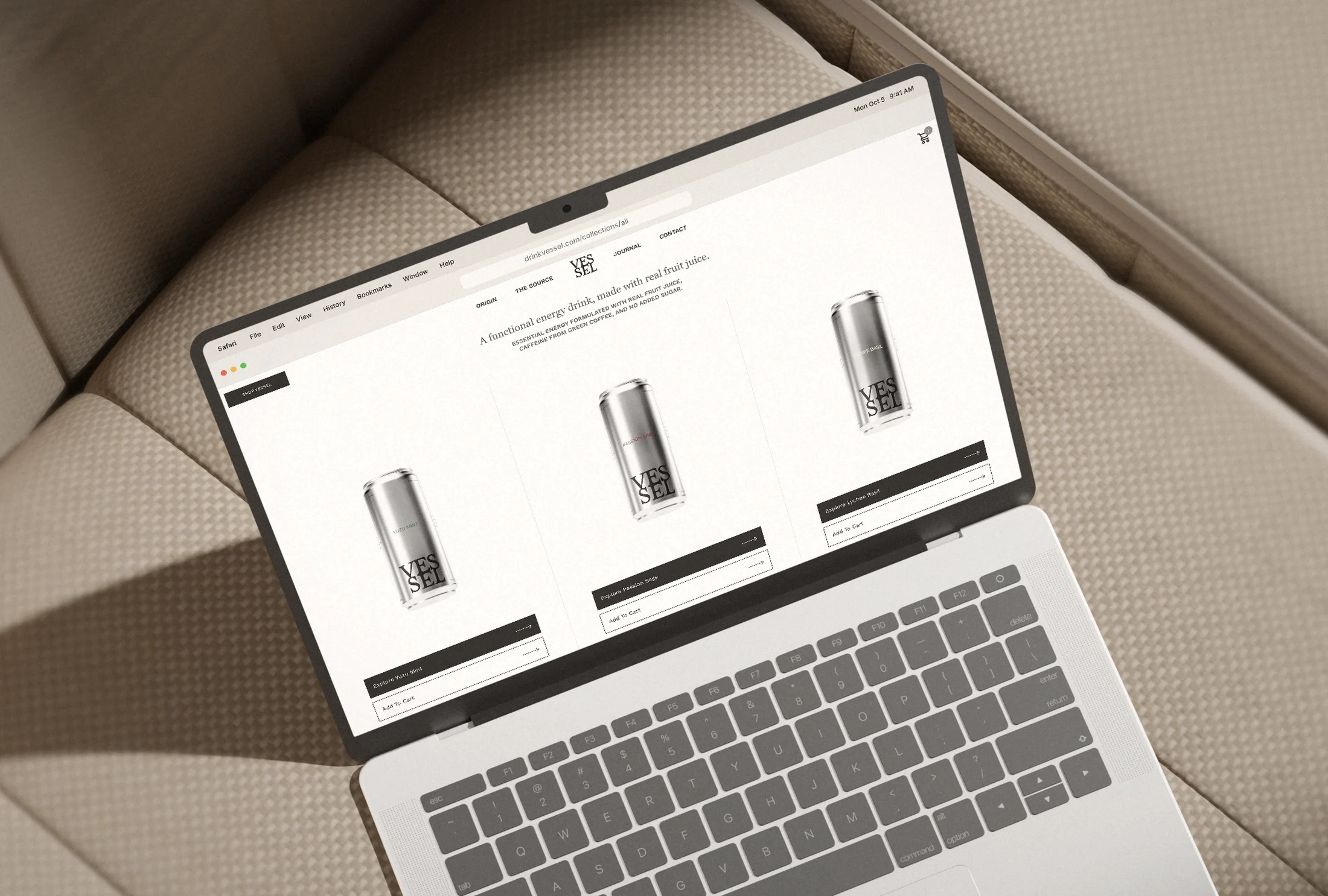
Shop.
Mobile. Scroll each screen.

Home

Product

The Source

Origin
Energy drinks are sold as a jolt. Vessel was built to be part of a healthy day.
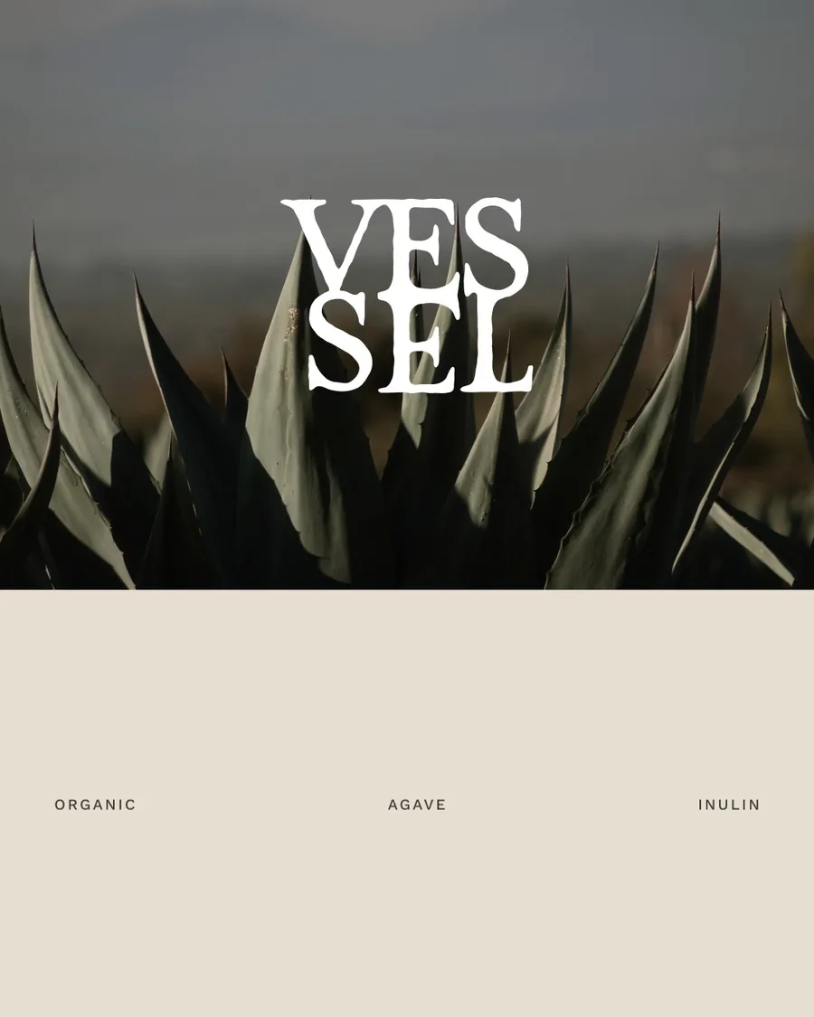
Vessel is a sparkling energy drink made with caffeine from green coffee, real fruit juice and a short functional stack: taurine, chromium, vitamin C, a B complex and a prebiotic fiber from agave. The formula was right. What it needed was a brand that made the difference visible before anyone read the label.
Vessel is positioned around wellbeing and the daily routine, with the whole world built around it in four months: strategy, identity, packaging, a custom Shopify storefront, Klaviyo email flows and a social system for launch.
200mg
Caffeine from green coffee
6
Functional ingredients, each named on the can
3
Flavors, each a fruit and one herb
Real
Fruit juice for flavor. No added sugar or sweeteners
Lychee
Every ingredient earns its place.
01 Brand strategy
A daily ritual that happens to have caffeine.
The category runs on intensity: louder cans, sweeter formulas, bigger claims. The buyer we found had moved past it.
They read labels, train on a schedule, protect their sleep and want what they drink to look as considered as the rest of their day. So Vessel moved off the energy shelf and next to coffee, matcha and the supplement routine.
Every message was built on wellbeing: what goes in, how the day feels, and why it earns a place in the routine.
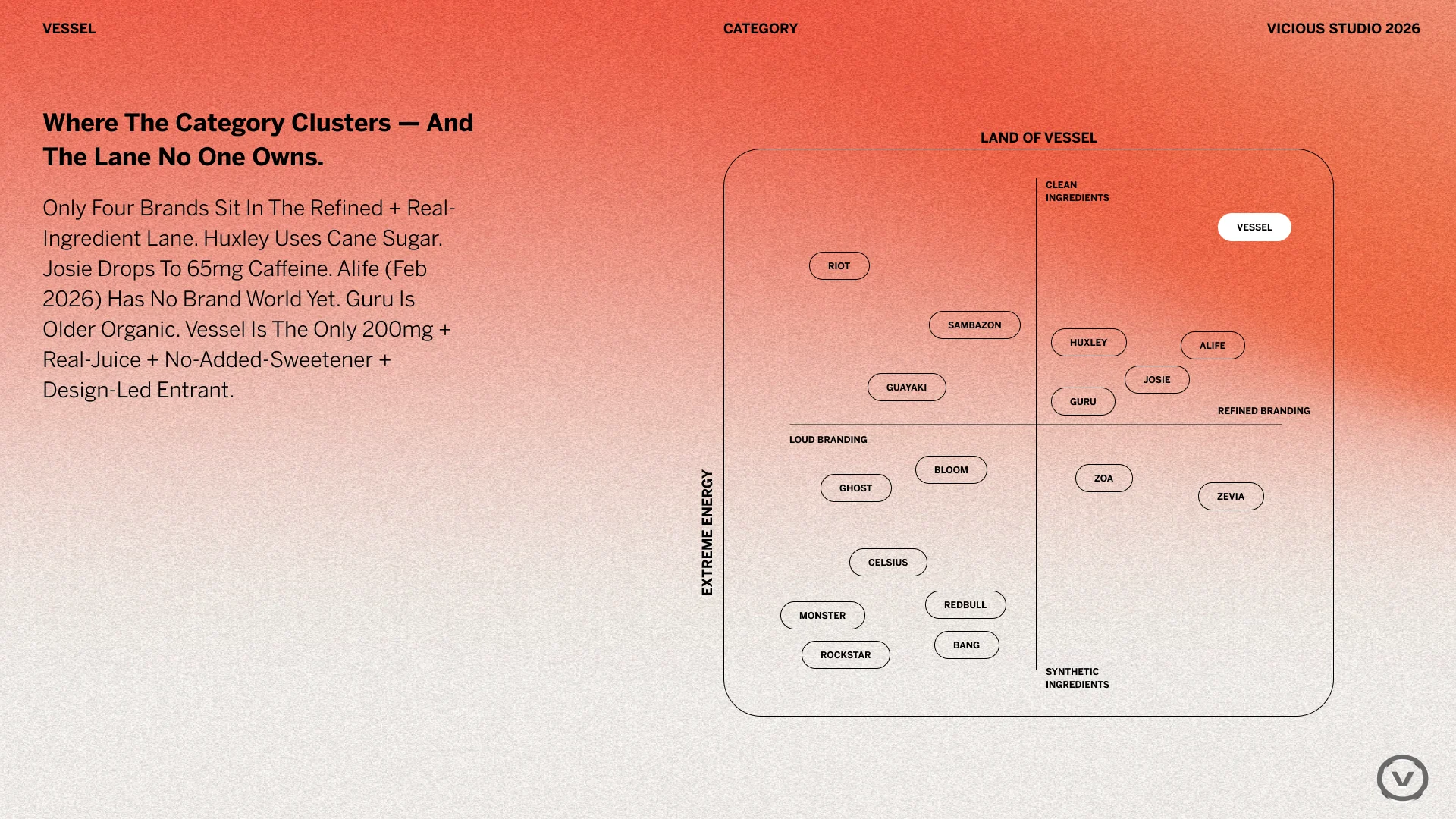
Where the category clusters, and the lane no one owned.
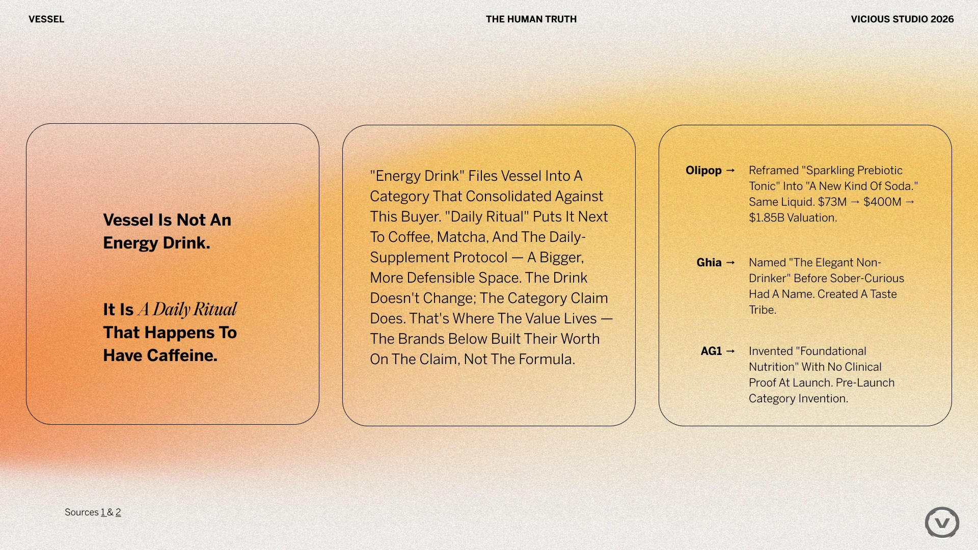
The reframe that drove every decision after it.
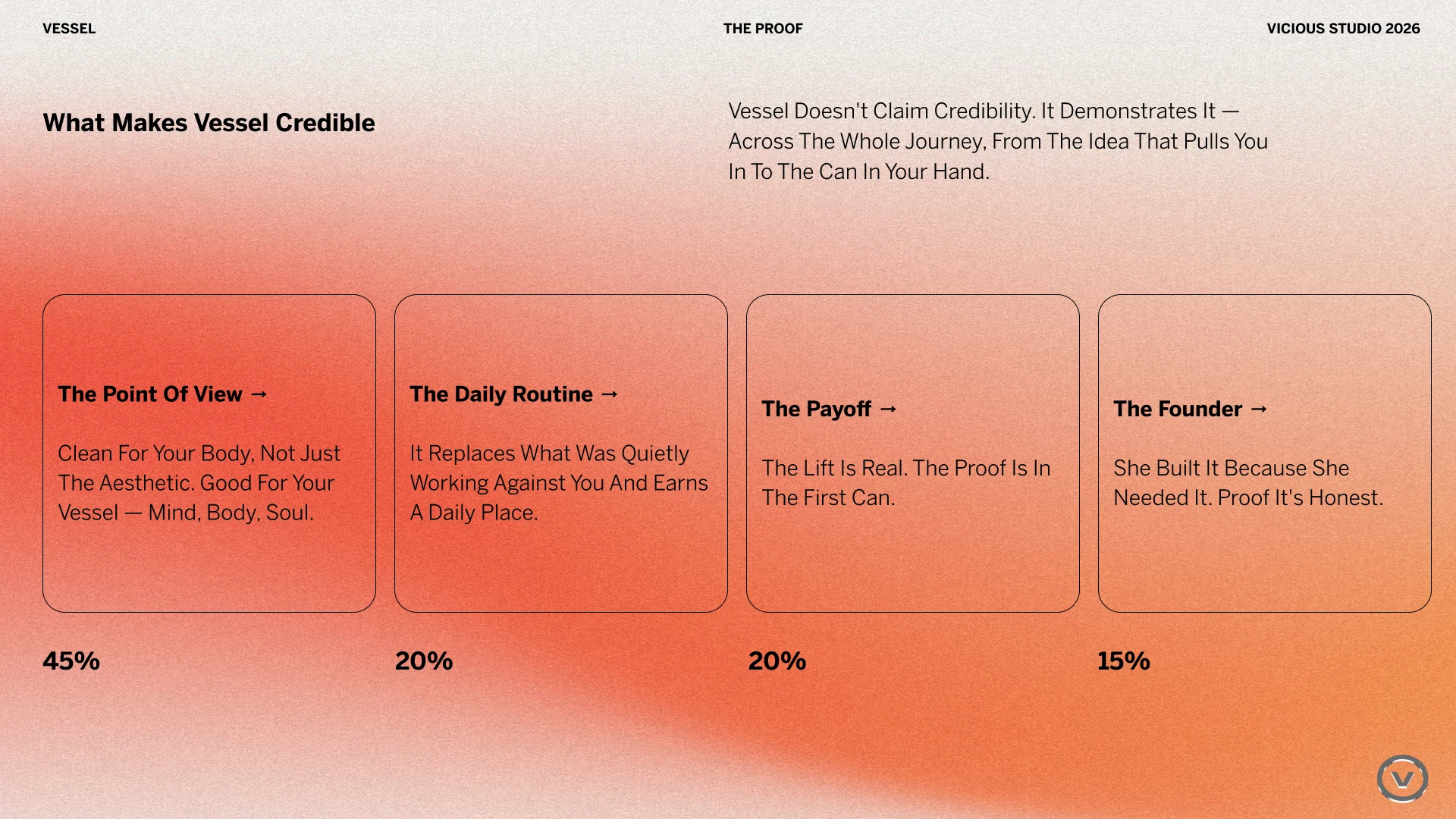
Proof weighted toward the routine and the payoff.
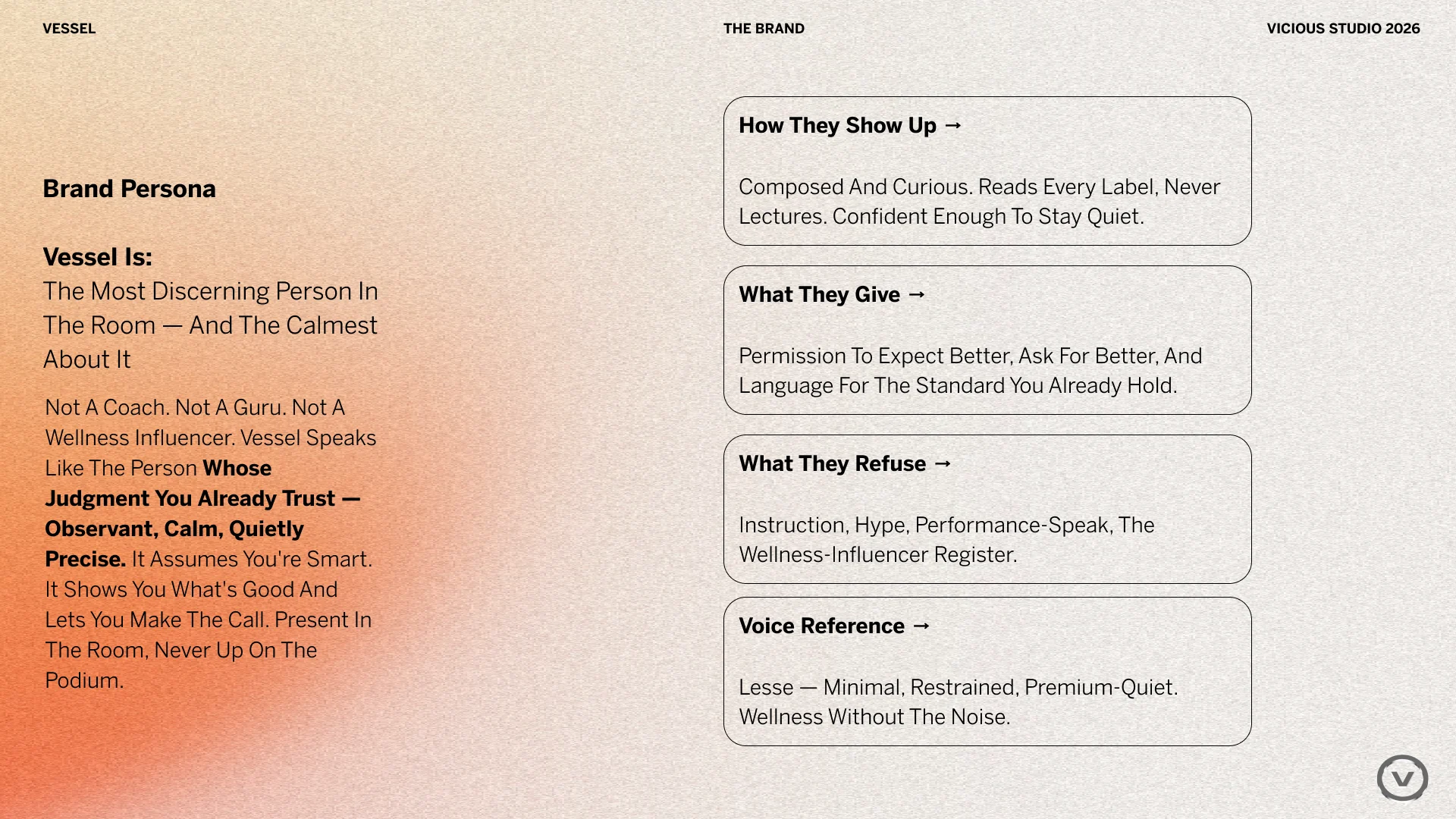
Poise: composed, curious, never loud.
Pillar
Daily ritual
The same considered choice each day, in place of the next coffee or can.
Pillar
Nothing to decode
A short formula with every ingredient named and every amount printed.
Pillar
Honor your Vessel
The body as the thing worth caring for. A line coined by the founders.
02 Visual identity
Quiet on purpose.
Every other can is shouting. Vessel speaks at a lower volume, and that restraint is what makes it feel expensive.
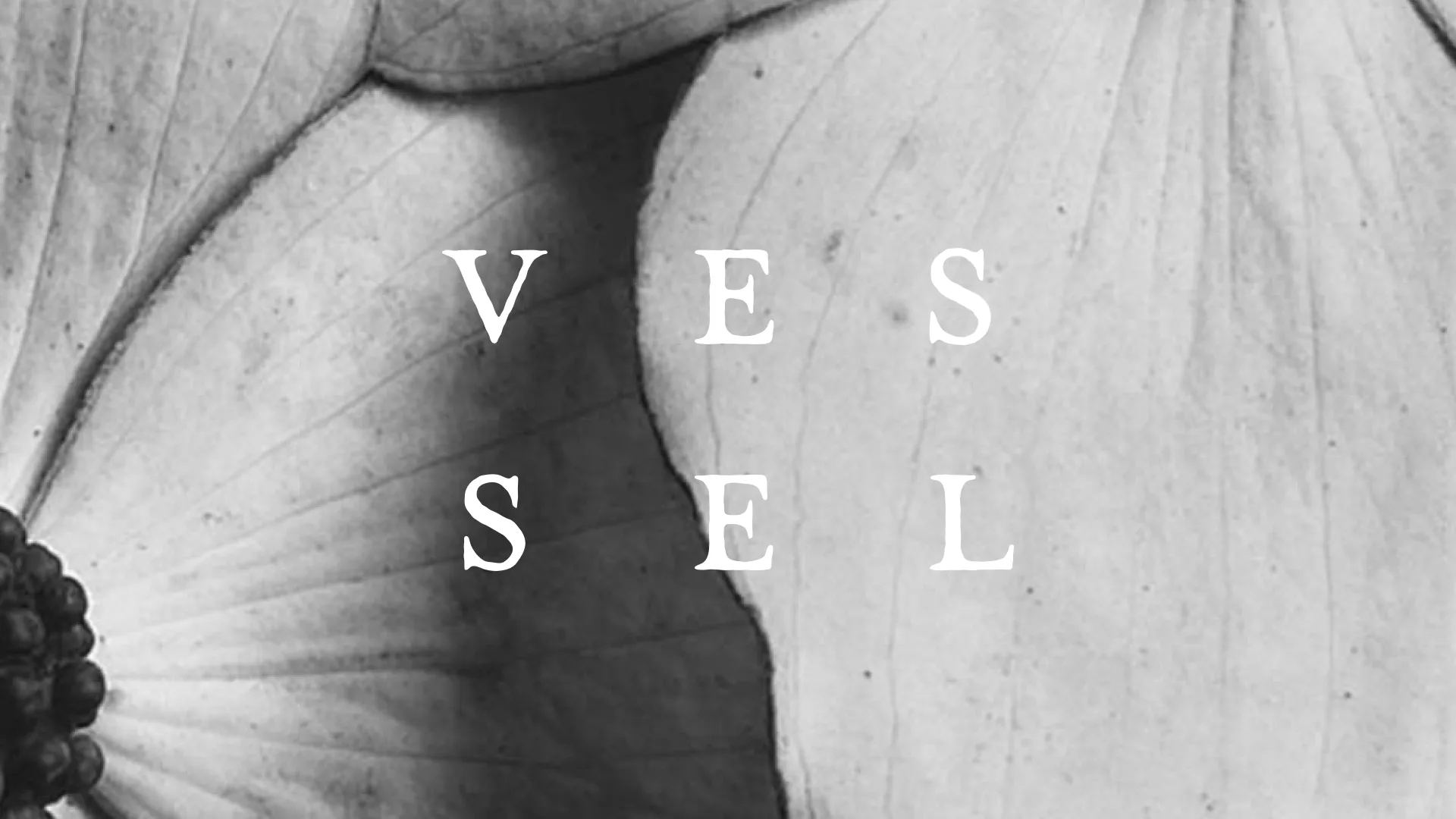
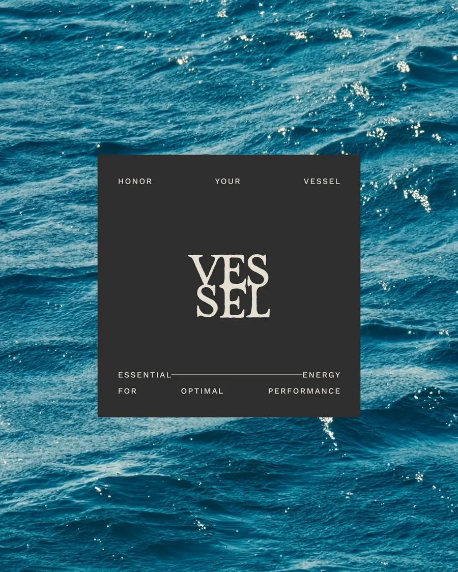
A distressed serif wordmark stacked into VES / SEL, a VSL monogram and a seal carrying Honor your Vessel. A palette of ink, mist, umber and tan pulled from stone, clay and bare metal, which leaves the color to the fruit.
Photography shows how energy feels rather than what it does: soft focus, motion and real light, set against source imagery of earth, water, stone and leaf.
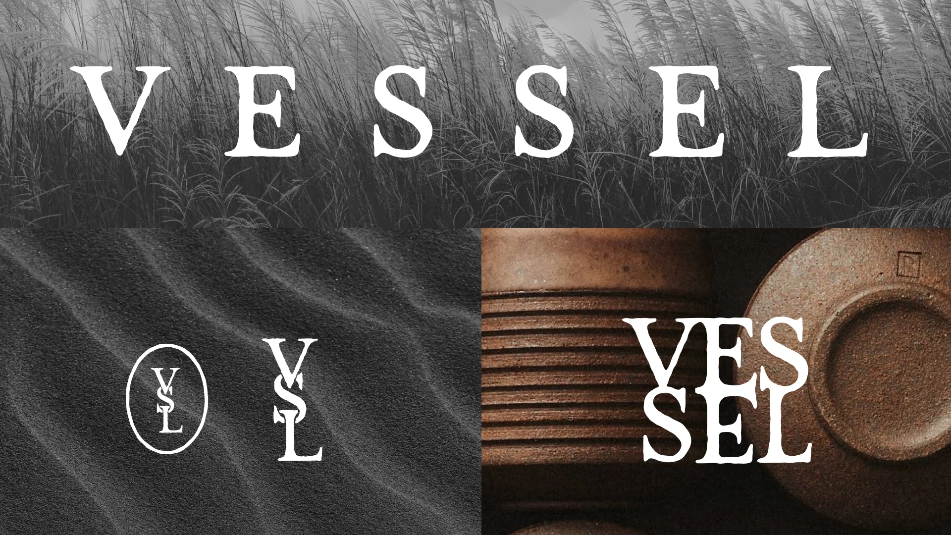
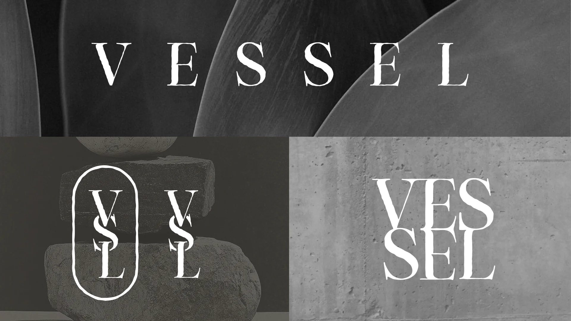
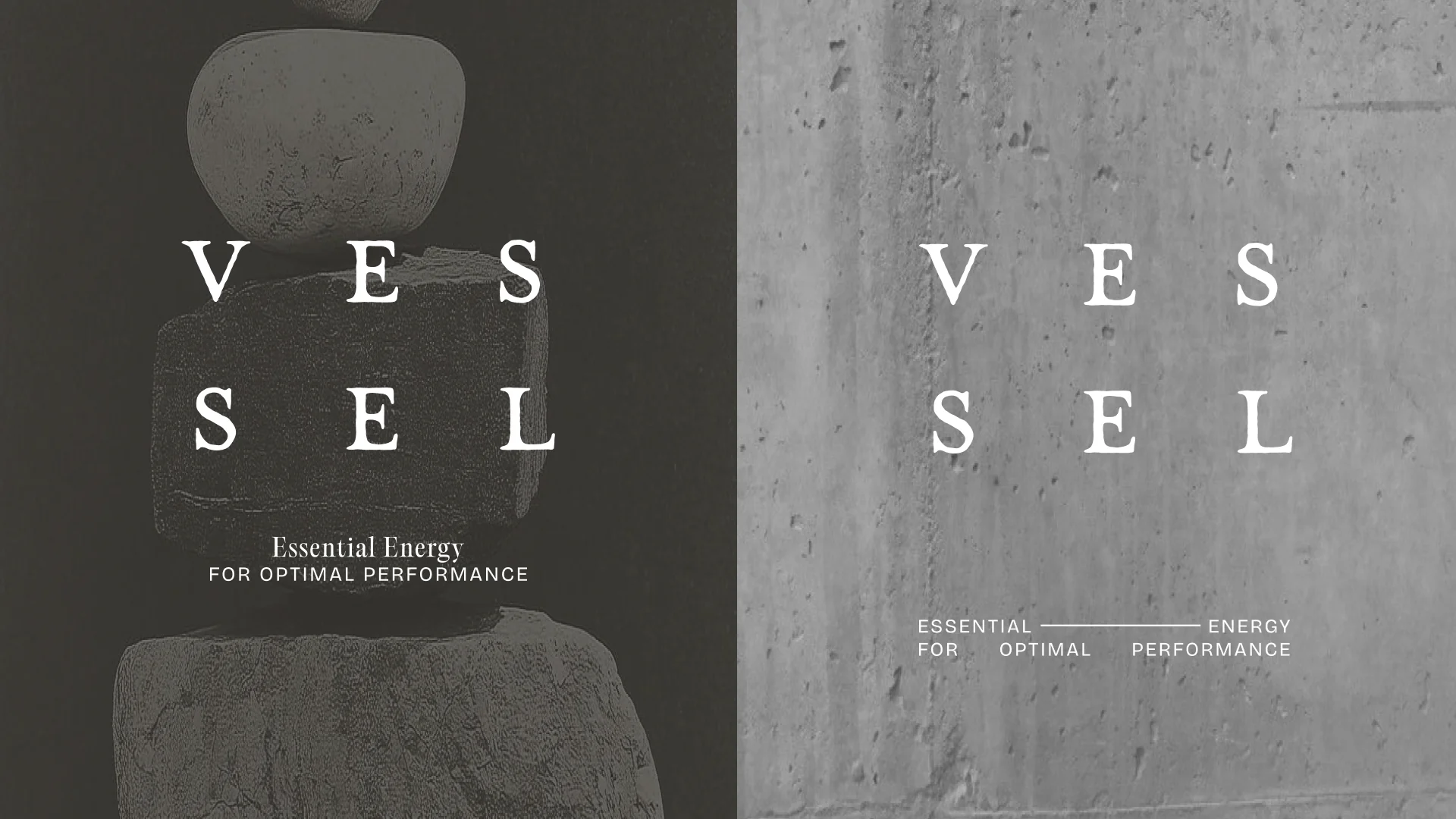
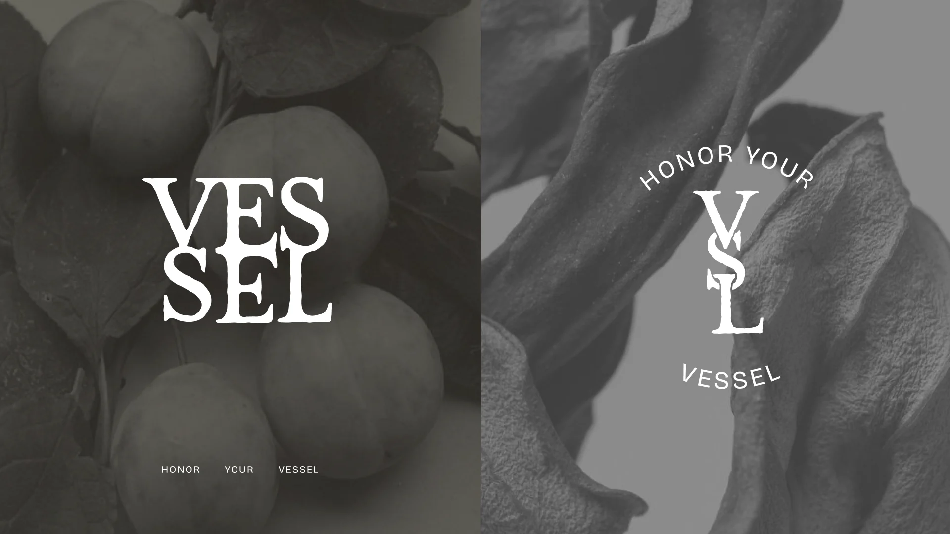
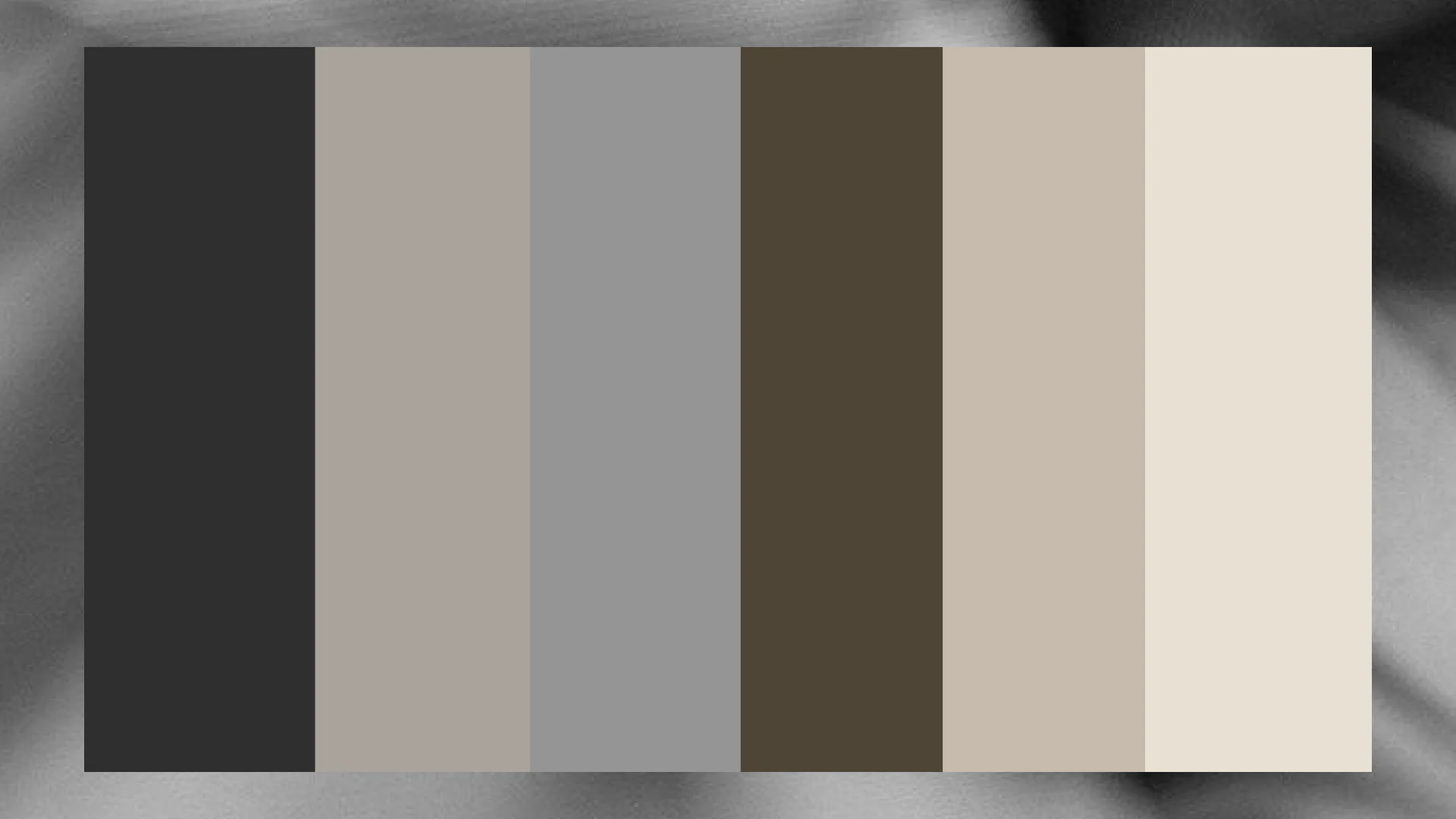
The palette: ink, umber, tan and mist.
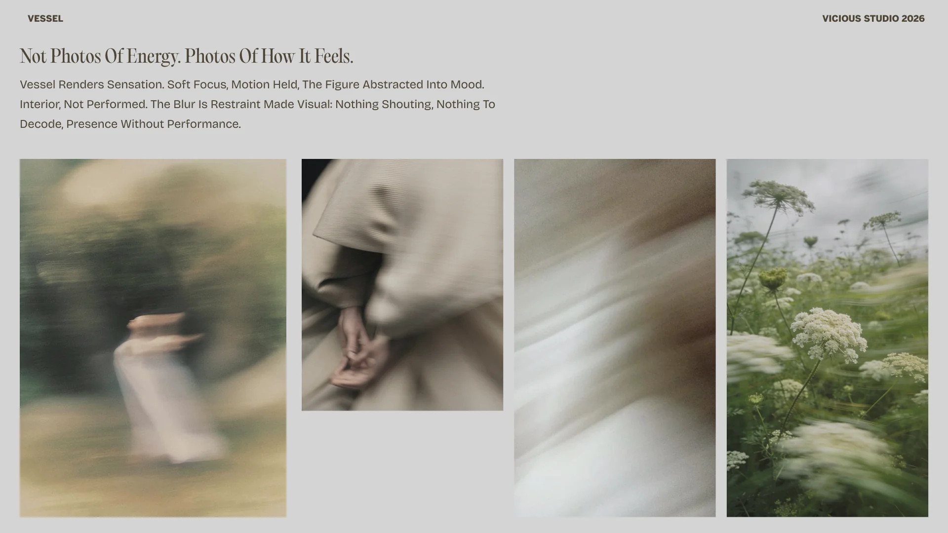
Art direction: sensation.
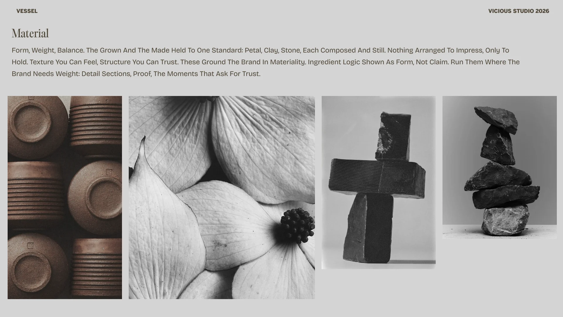
Material.
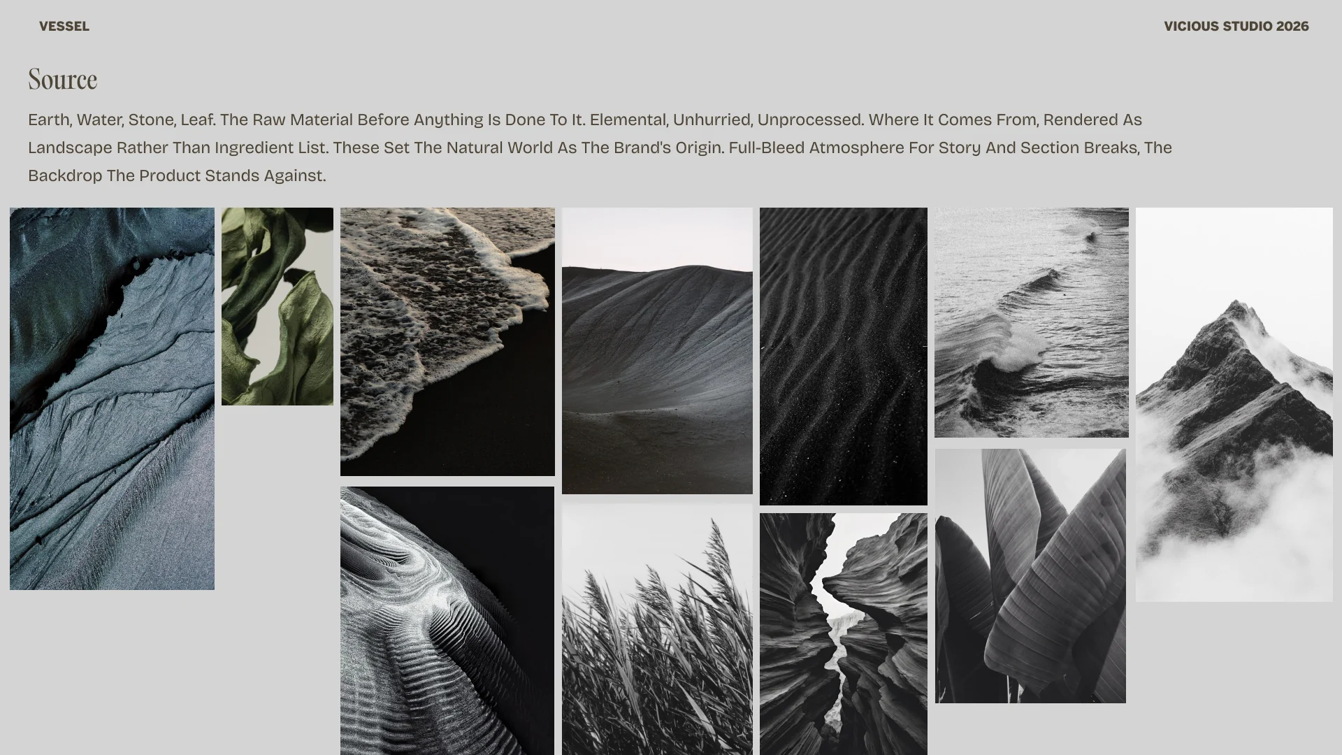
Source.
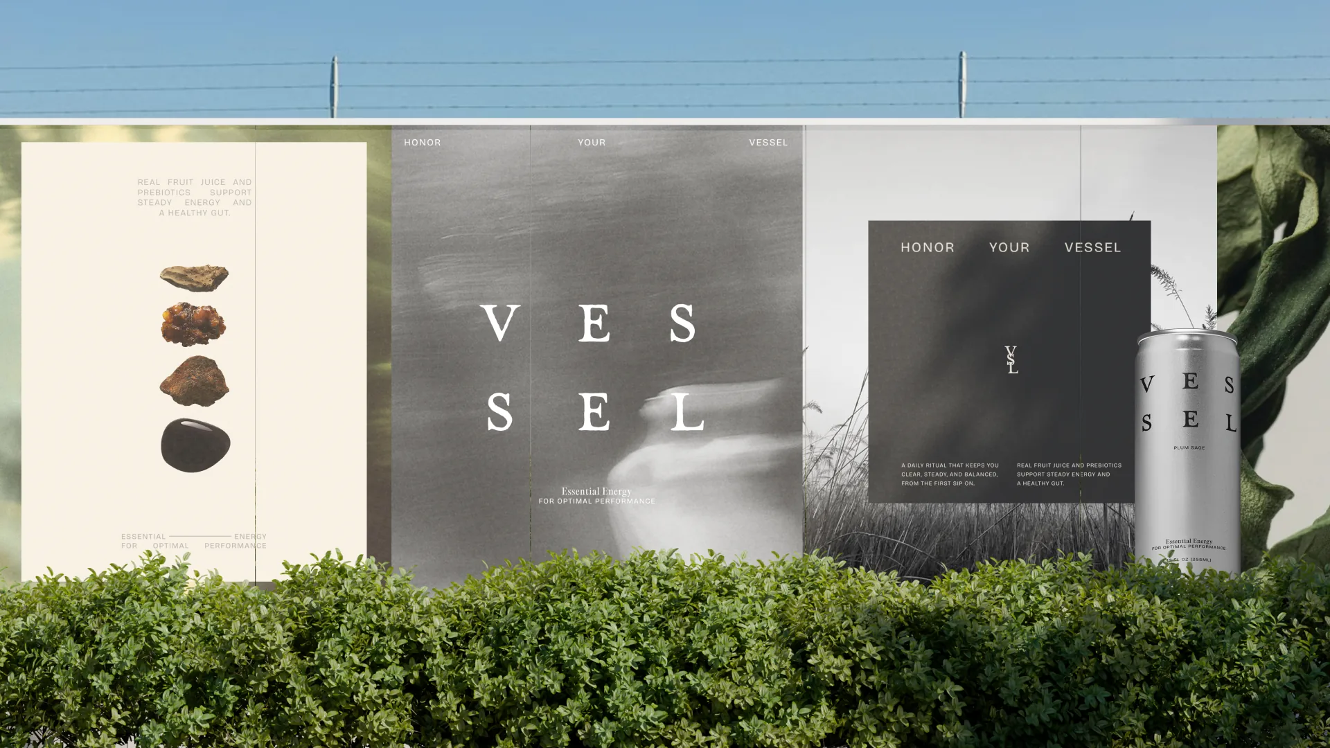
Out of home.
Mint
Choose a better ritual.
03 Web
An editorial storefront.
A custom Shopify build that reads like a magazine and sells like a store.
The homepage opens on the ritual. Product pages lead with the can, then the full ingredient story. The Source and Origin pages carry the why, and the Journal feeds the funnel from social to signup.
Every page shares one design system with email: EB Garamond headlines, Work Sans for everything else, and the same quiet palette.
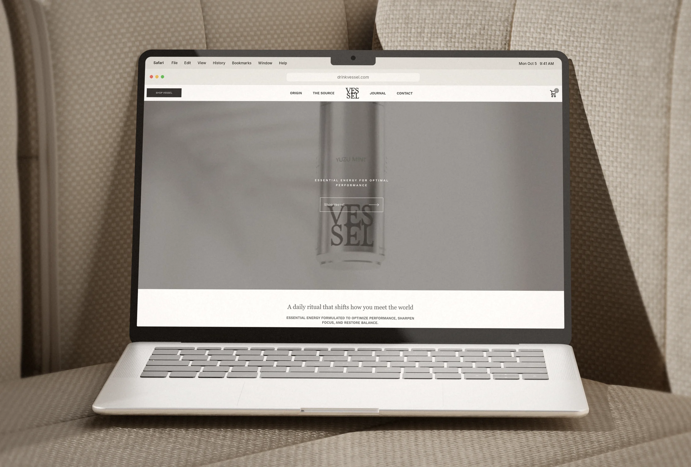
Home.
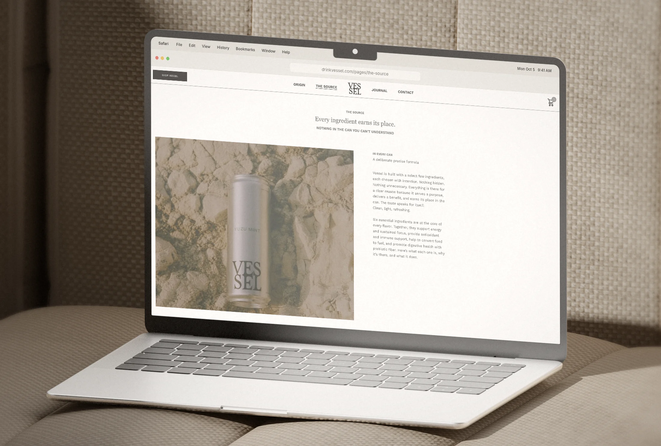
The Source.
Full pages. Scroll each window.
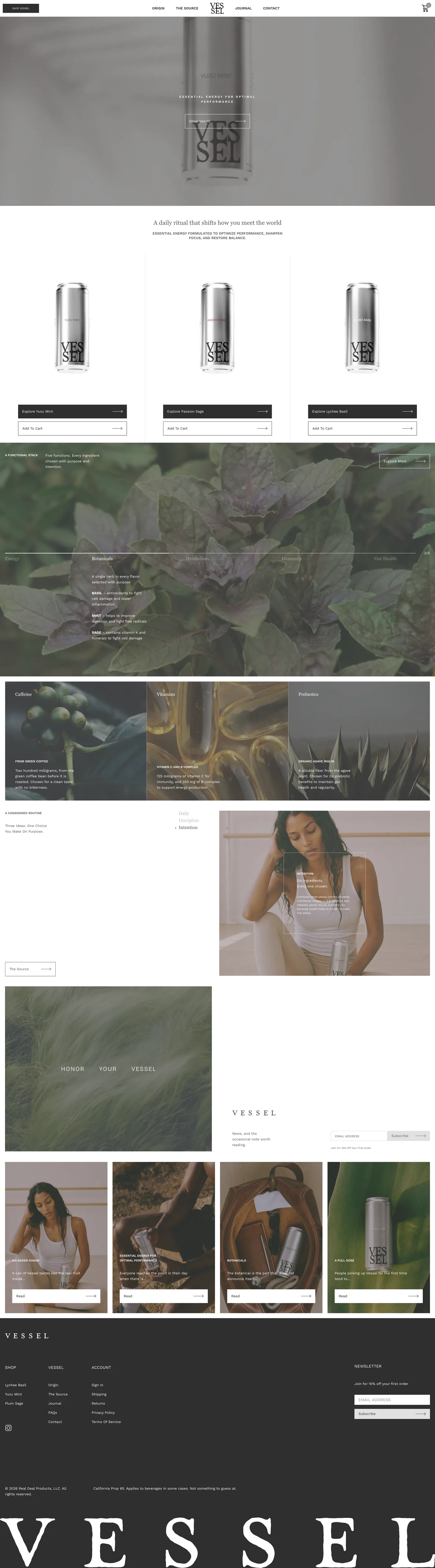
Home
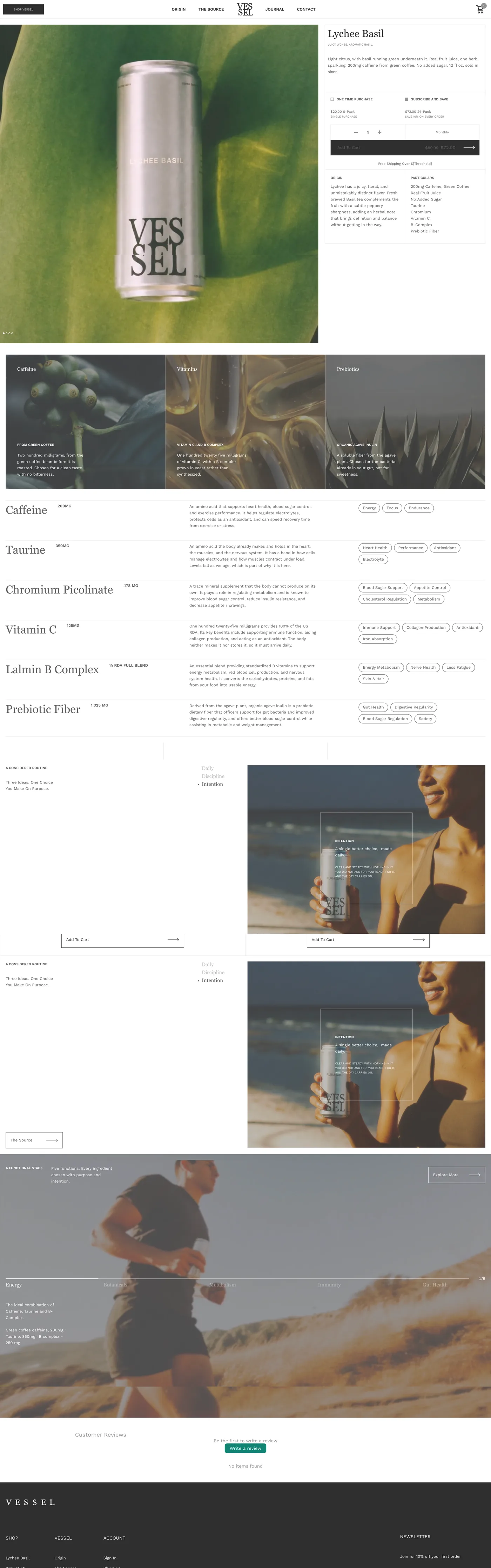
Product
04 Social and email
One voice, every channel.
Social finds the buyer, the Journal earns the signup, and email delivers the reasons to buy.
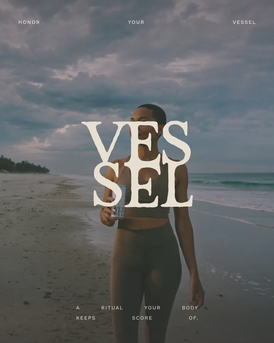
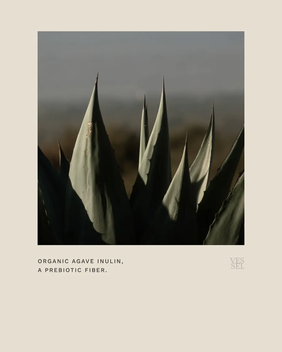
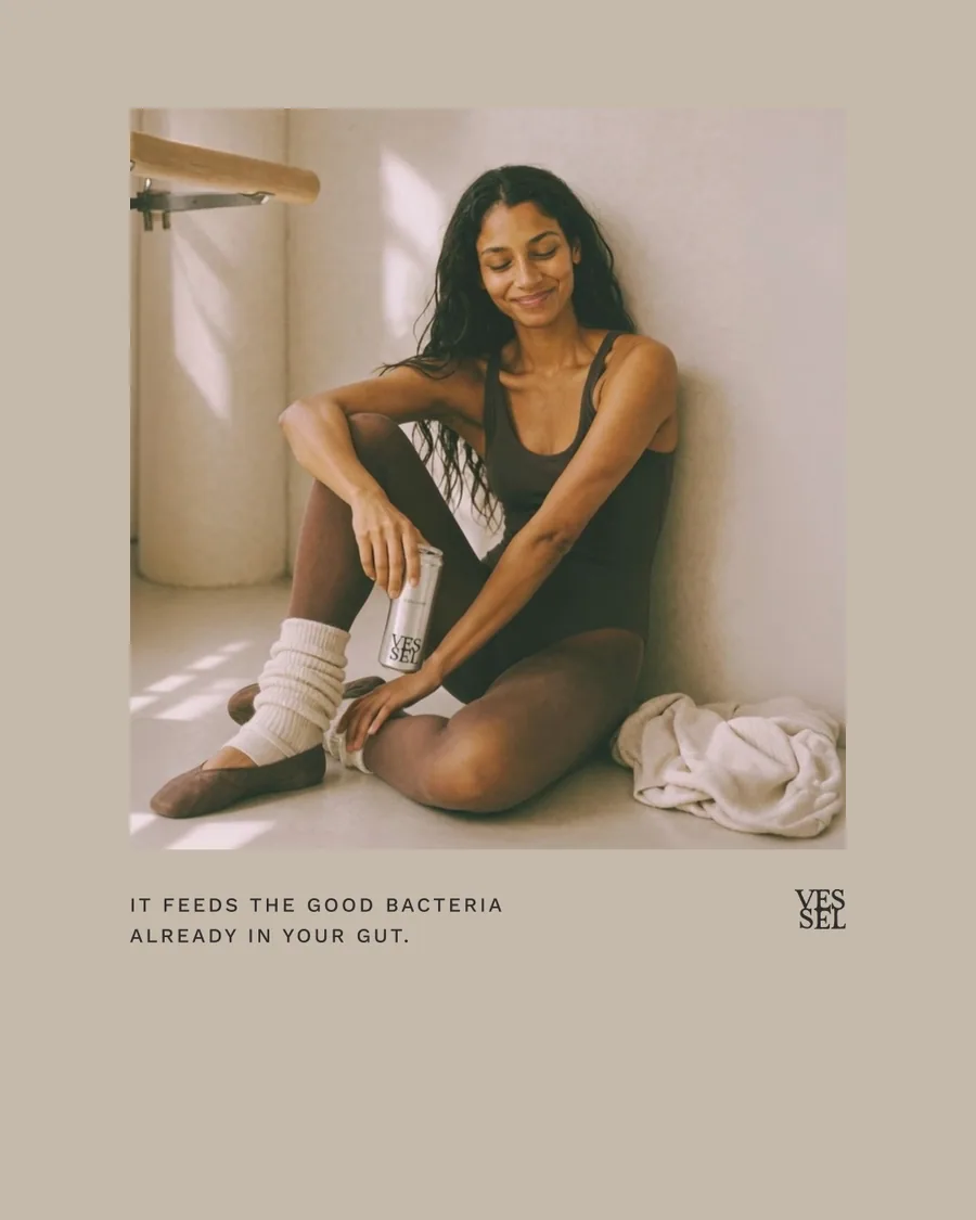
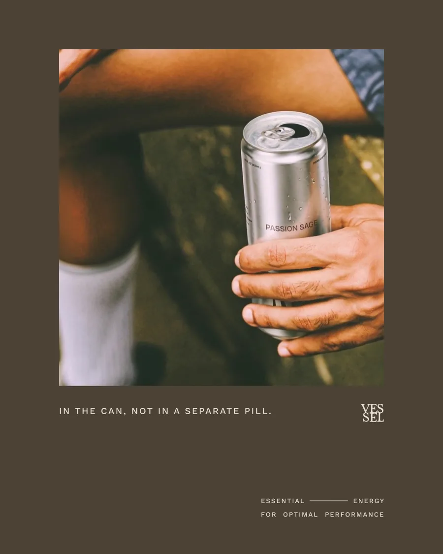
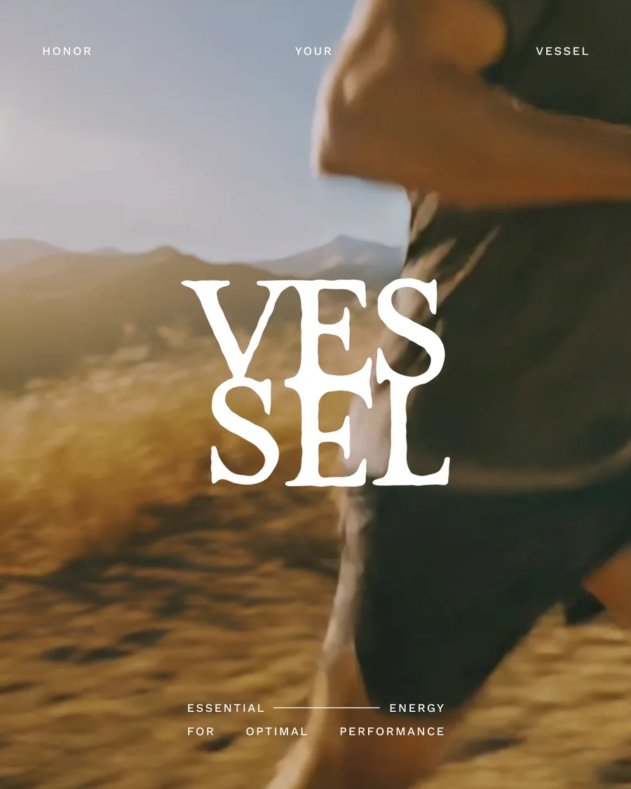
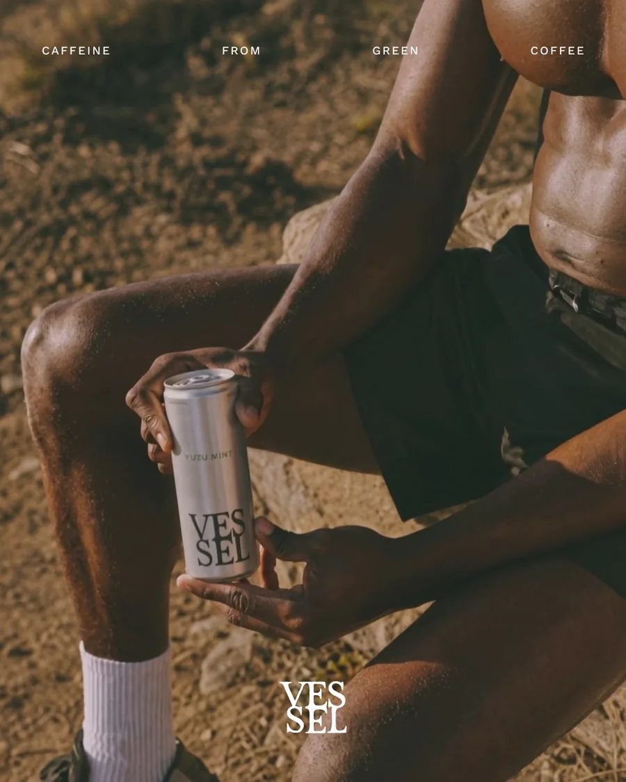
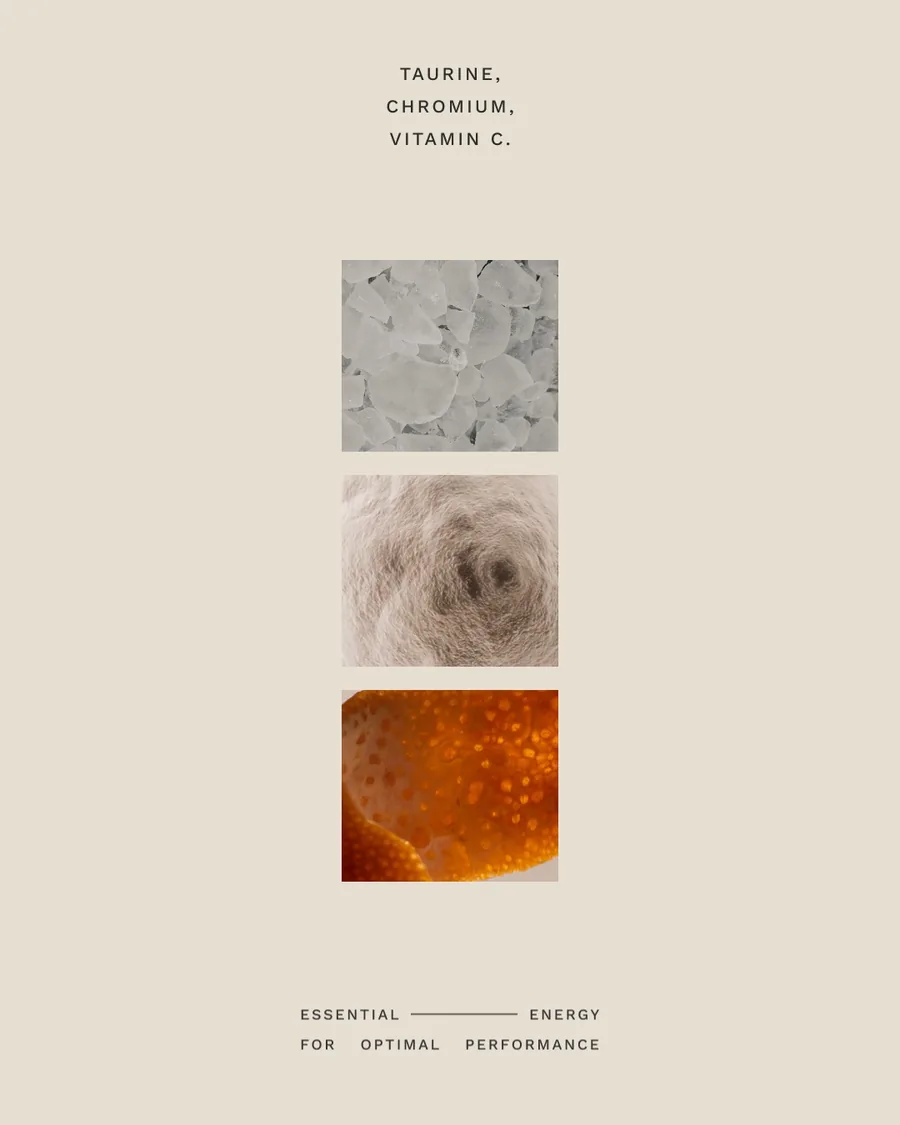
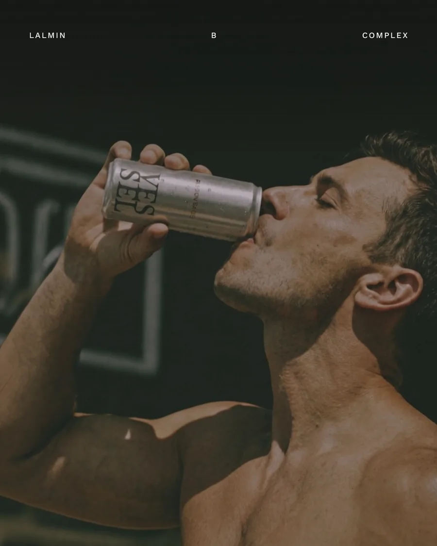
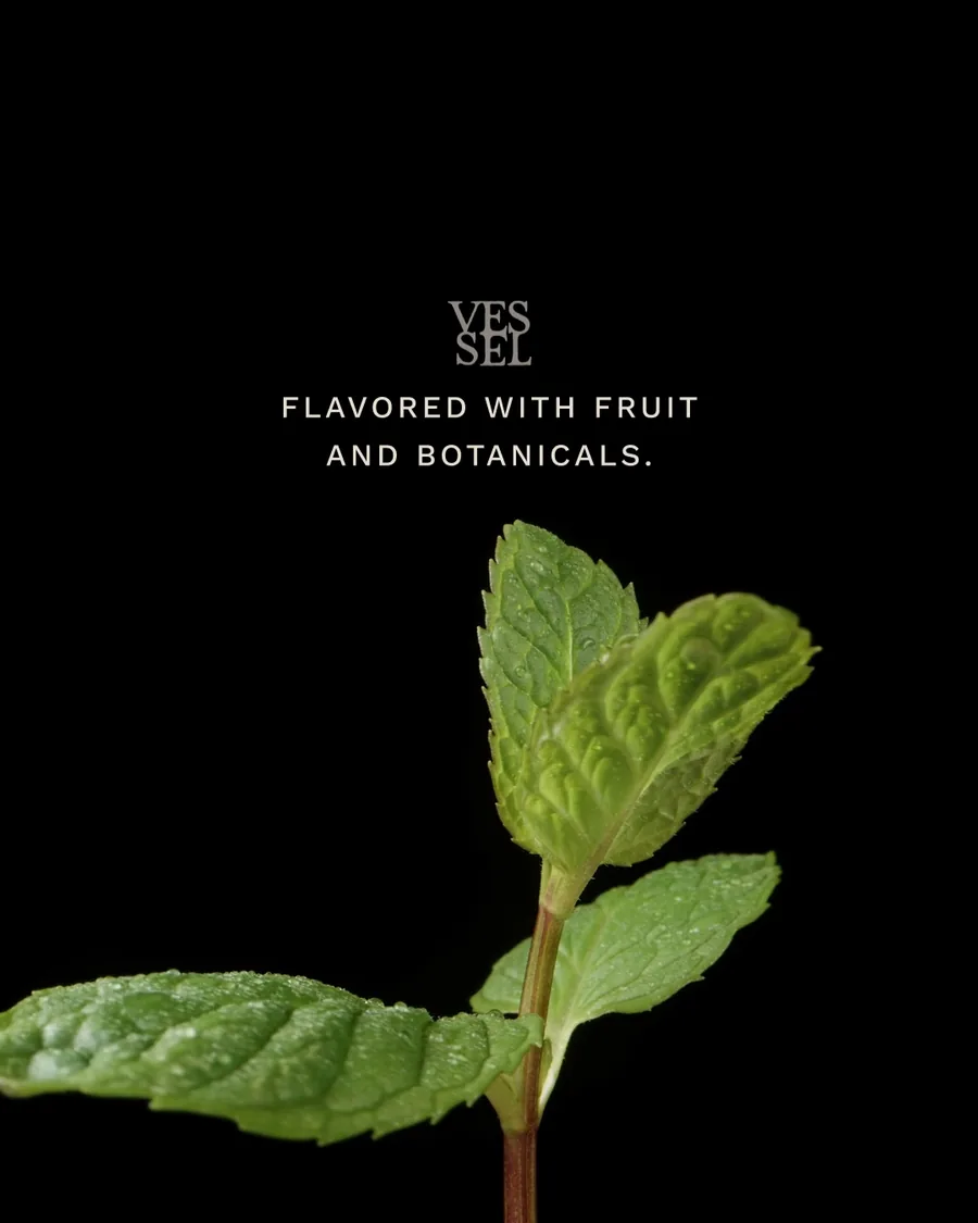
Fifteen organic posts across three stories: the prebiotic, the essentials and the flavors. Three paid ads are mapped to the top, middle and bottom of the funnel, with Reels built to move people down it.
Every frame follows the brand book: the stacked mark, Work Sans type, real photography and nothing shouting.
Paid ads and Reels
Paid, top of funnel
Paid, middle of funnel
Paid, bottom of funnel
Reel 1
Reel 2
Reel 3
Organic posts
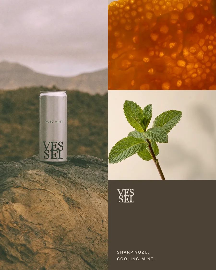
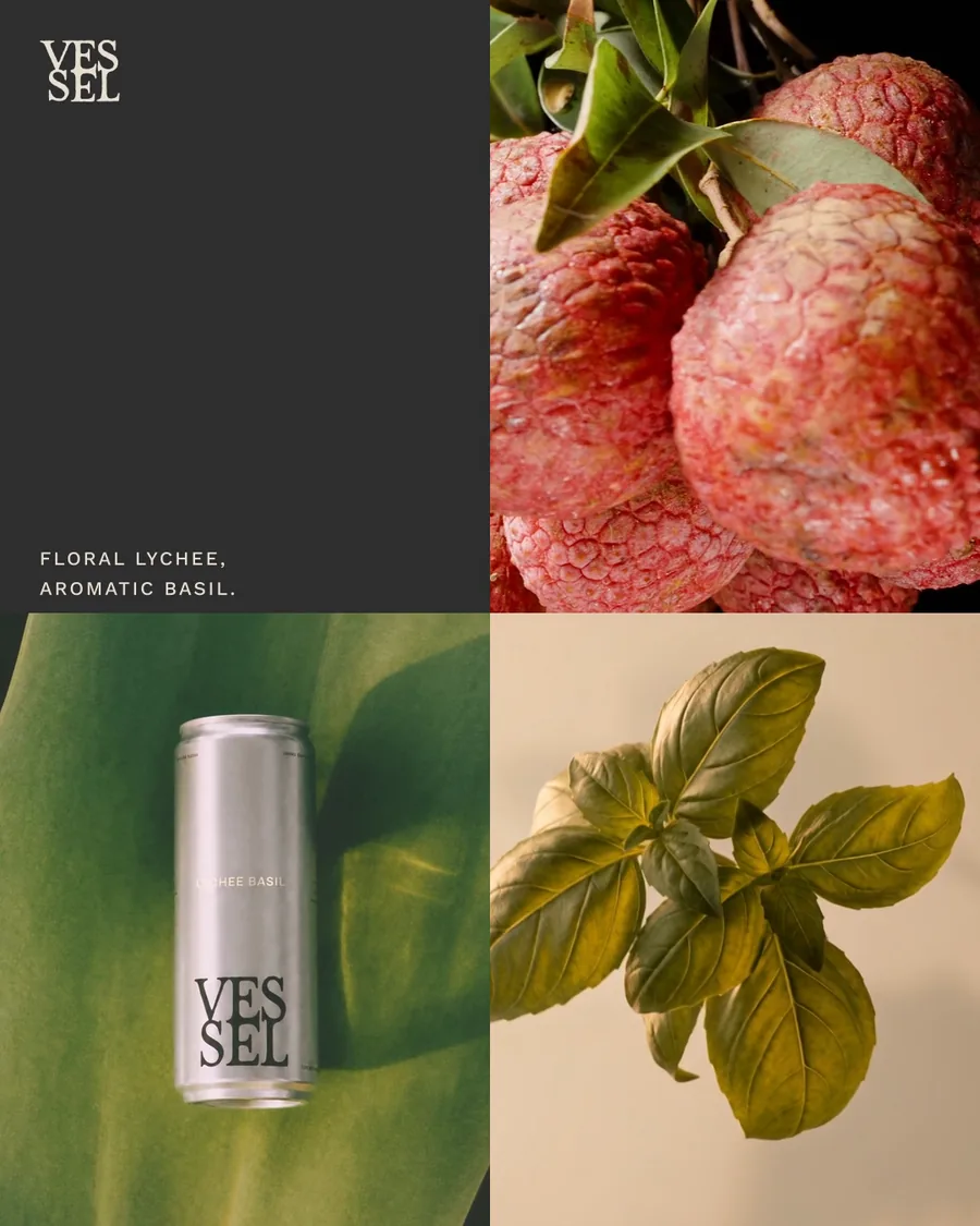
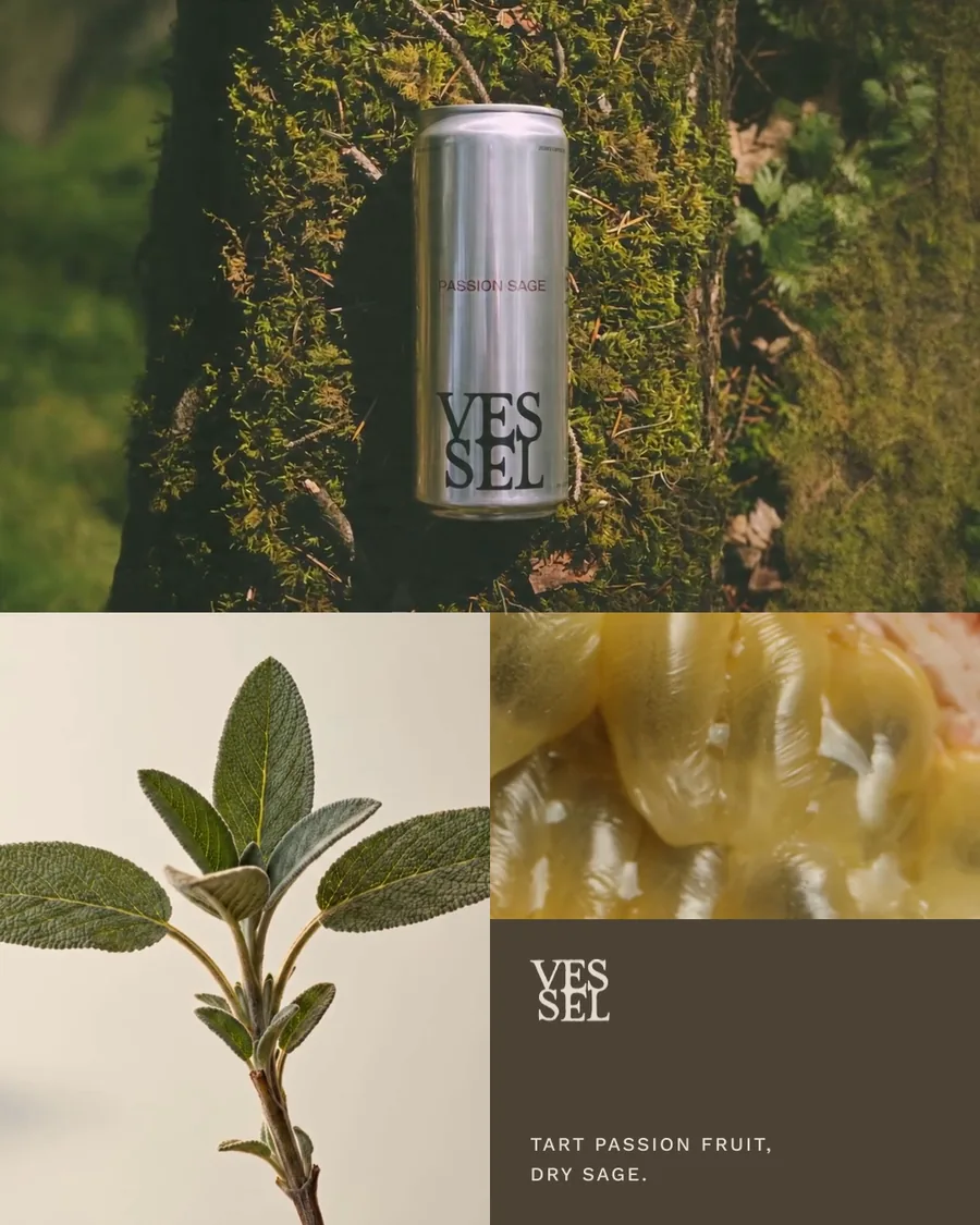
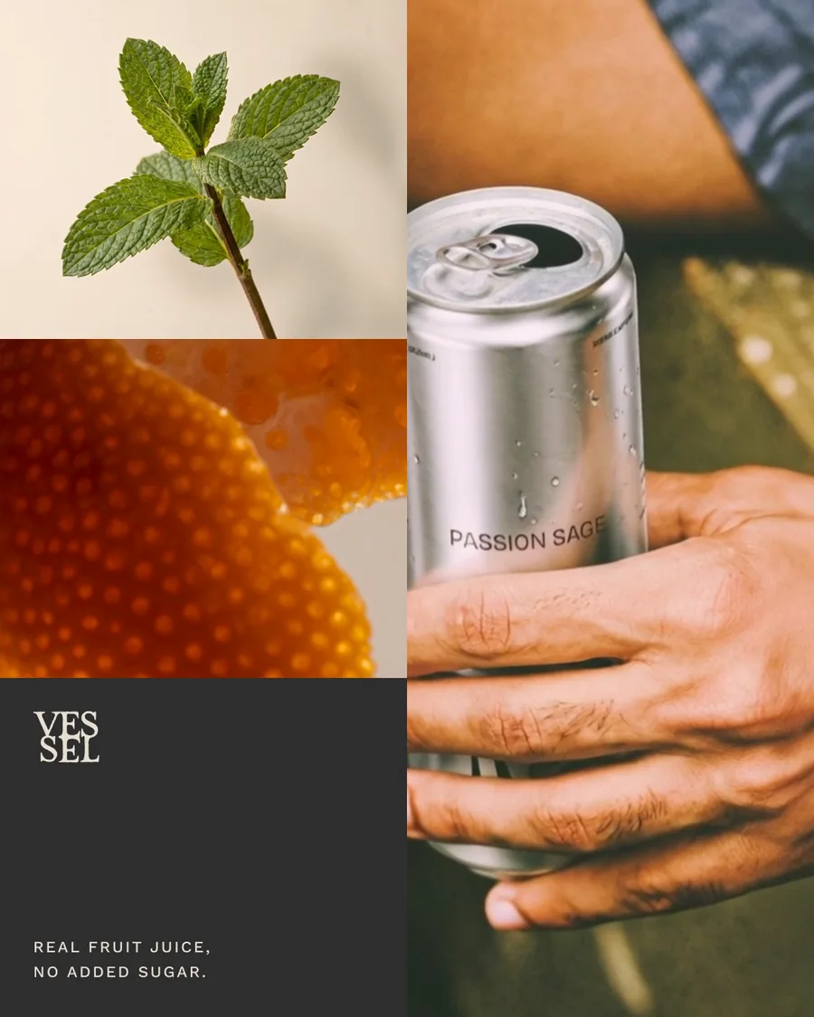
Nine emails, three flows.
Welcome, abandoned checkout and browse abandonment, built in Klaviyo with live text and the site's components. Each email teaches one reason to choose Vessel: the ingredients, the flavors, the ritual. Scroll sideways to see all nine.
Welcome 1
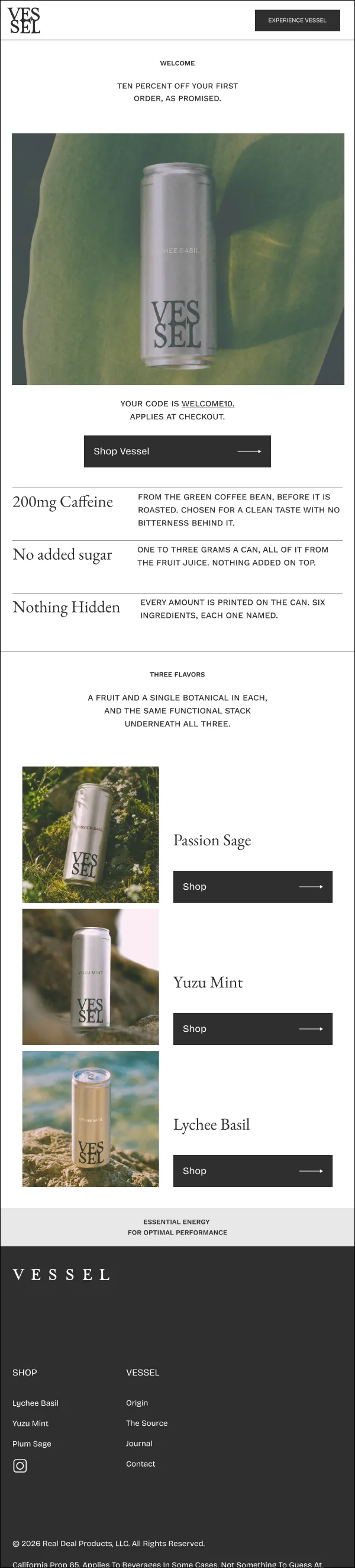
Welcome 2
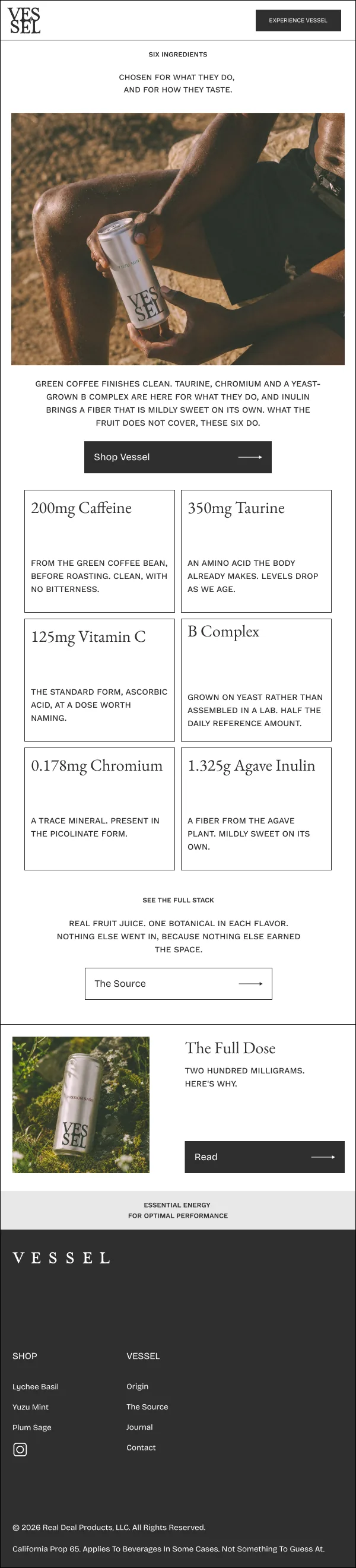
Welcome 3
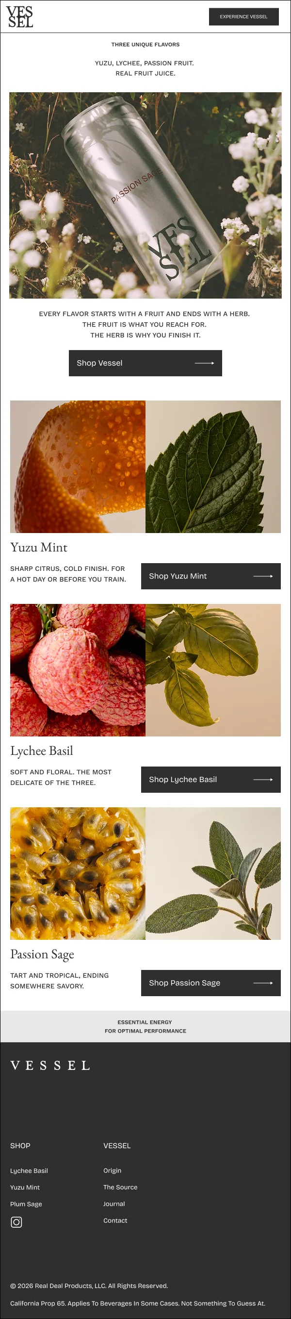
Abandoned checkout 1
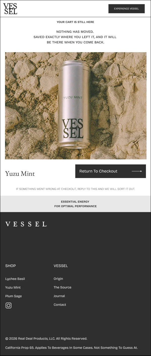
Abandoned checkout 2
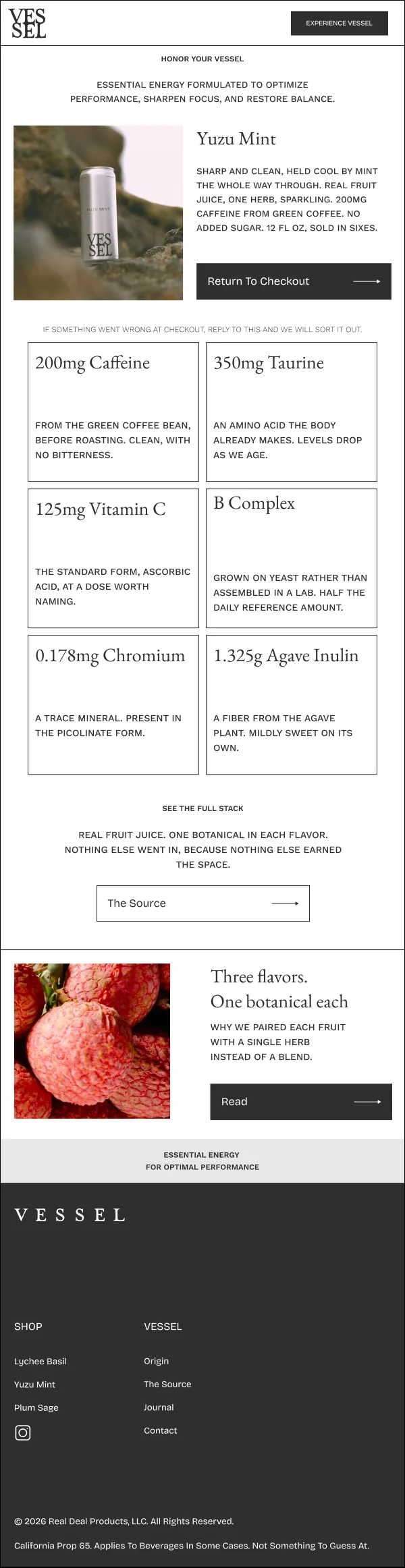
Abandoned checkout 3
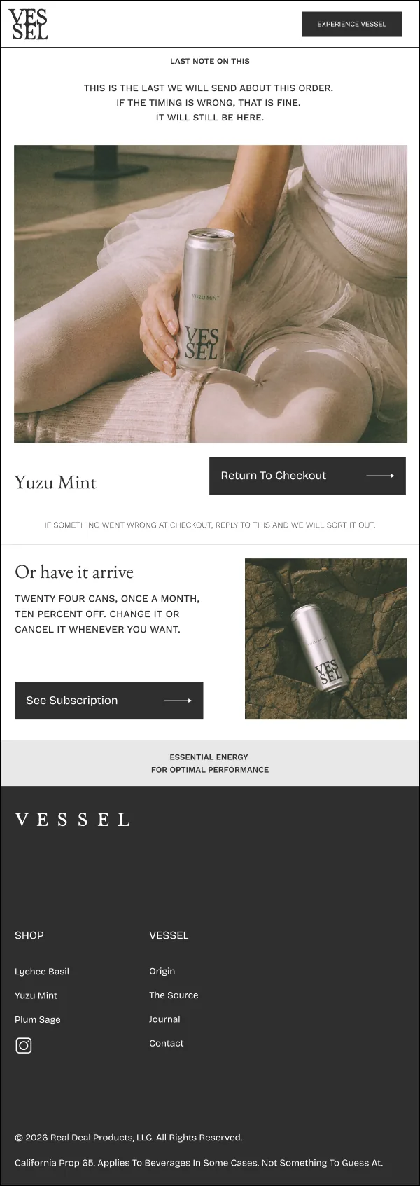
Browse 1
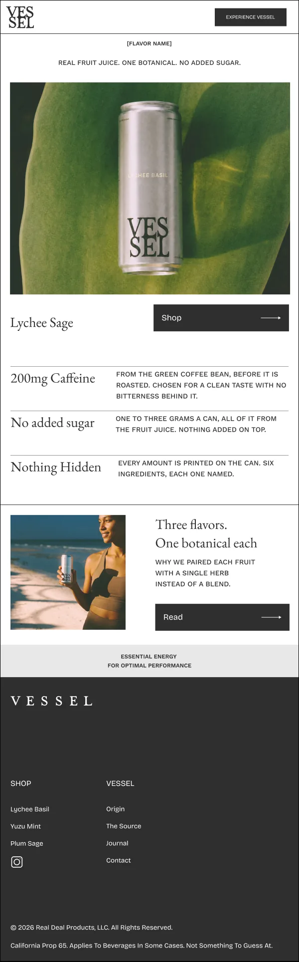
Browse 2
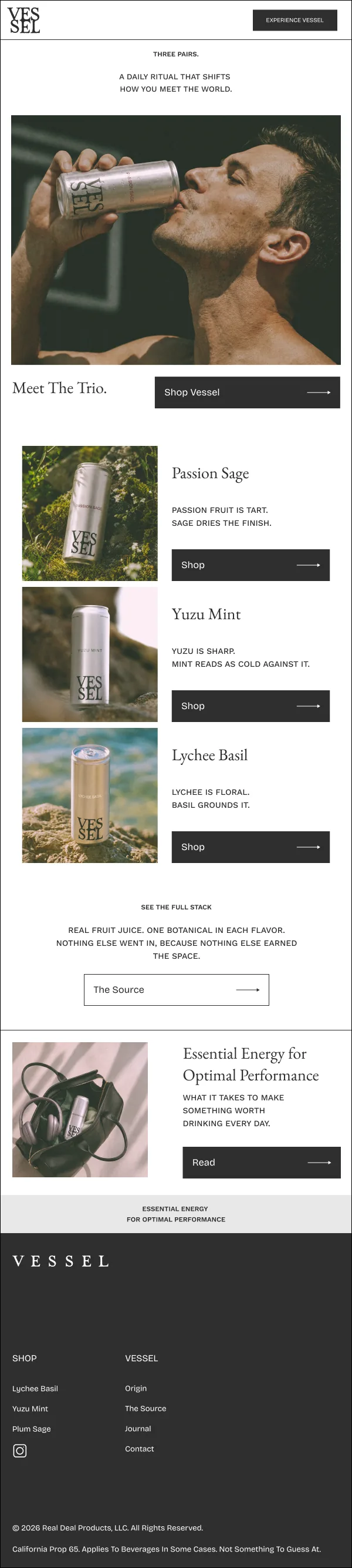
Browse 3
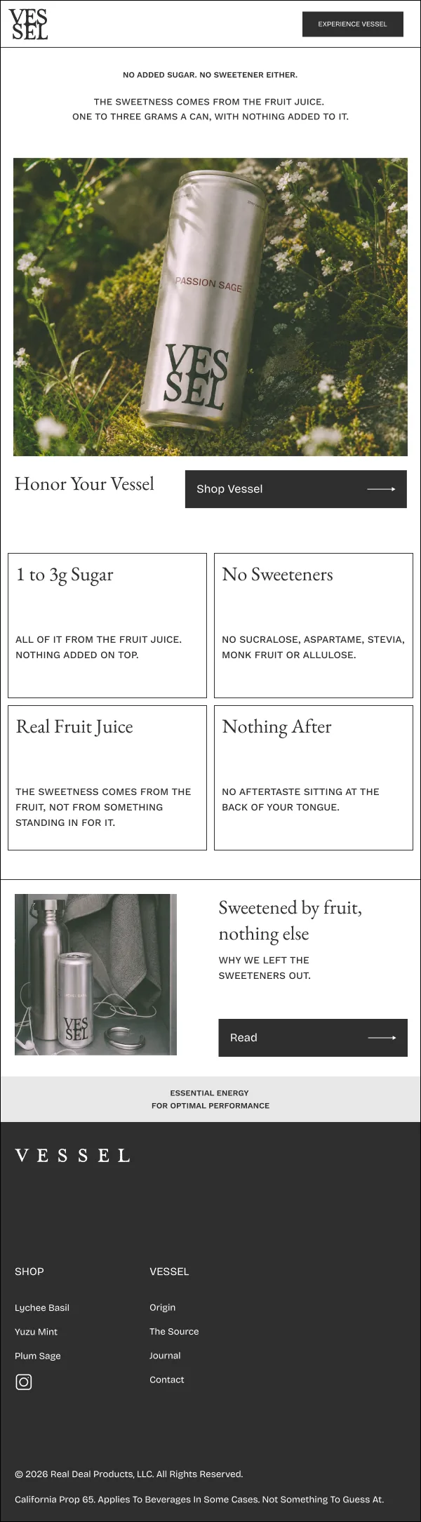
Basil
Flavored with fruit and botanicals.
05 Packaging
Bare aluminum. Purposely minimal.
The can is brushed aluminum with the type printed straight on the metal.
A stacked wordmark, a flavor name in one accent color, and nothing else on the front. Three flavors read as one set on a counter or in a fridge door, and the shipper carries the wordmark across its faces so the box arrives already looking like the brand.
Lychee Basil.
Passion Sage.
Yuzu Mint.
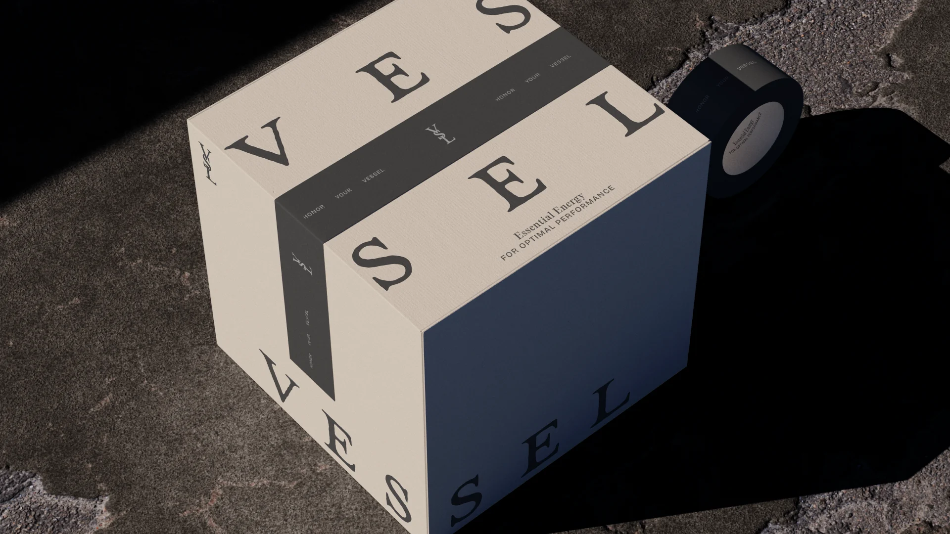
The shipper.
Honor your Vessel.
Client
Real Deal Products, LLC
Studio
Vicious Studio, New York
Work
Brand strategy, visual identity, packaging, Shopify, Klaviyo email, social
Year
2026