

BUILT BY PRACTITIONERS,
FOR PRACTITIONERS.
Cannex Health was born from a simple but urgent insight: the CBD supplement space is saturated with lifestyle brands, yet few—if any—speak directly to licensed professionals. For decades, CBD has straddled the line between wellness trend and taboo substance, often misaligned with clinical standards and devoid of accessible education. Our mission with Cannex was to flip that paradigm—crafting a brand and digital ecosystem for practitioners, by practitioners.
We designed a brand that puts transparency, education, and medical credibility first. Then, we built a platform that delivers on that promise: a professional-only e-commerce site backed by deep educational resources, curated product discovery tools, and a clinical-grade aesthetic.
Strategy

We positioned Cannex as a CBD brand built entirely for healthcare providers—rooted in science, wrapped in trust, and framed by clinical rigor.
Identity

Through careful naming, visual identity, and voice, we created a brand that looks and feels like it belongs alongside medical institutions, not wellness fads.
Web

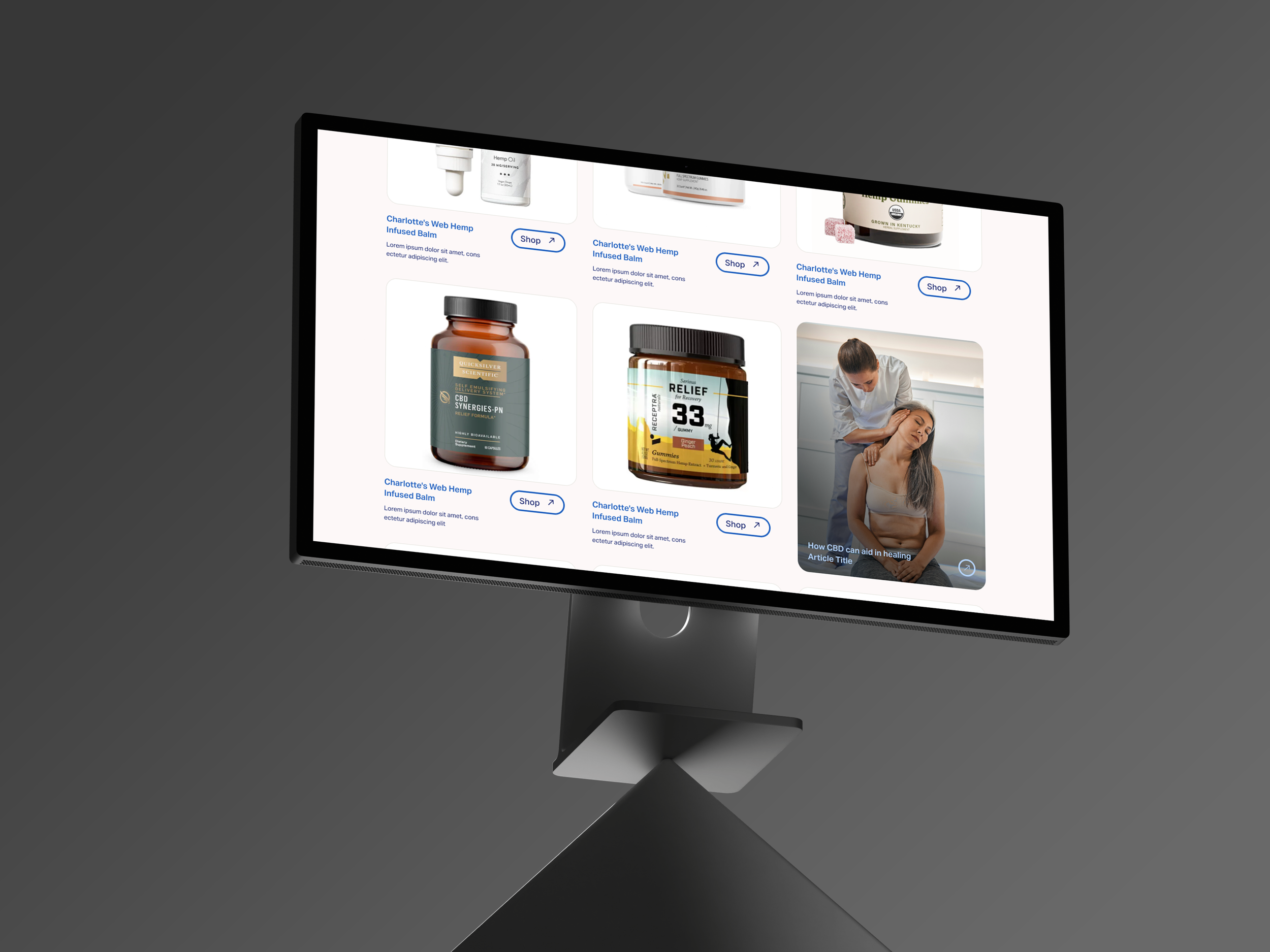
The Cannex site functions more like a clinical support platform than a retail shop—complete with condition-based shopping, specialty-based filtering, and a library of practitioner-grade content.
STRATEGY & POSITIONING
Legitimacy at
It’s Core
We set out to reposition CBD not as a lifestyle choice—but as a clinical tool. The brand needed to establish itself as medically credible, research-backed, and totally divorced from the visual language of recreational cannabis.
Our strategy focused on grounding Cannex in the daily routines of health and wellness providers, reflecting how they treat, prescribe, and build patient trust. This wasn’t about marketing fluff—it was about institutional alignment. We examined how medical professionals interact with digital tools, what brand signals drive trust, and how to deliver clear, relevant education within a retail context.


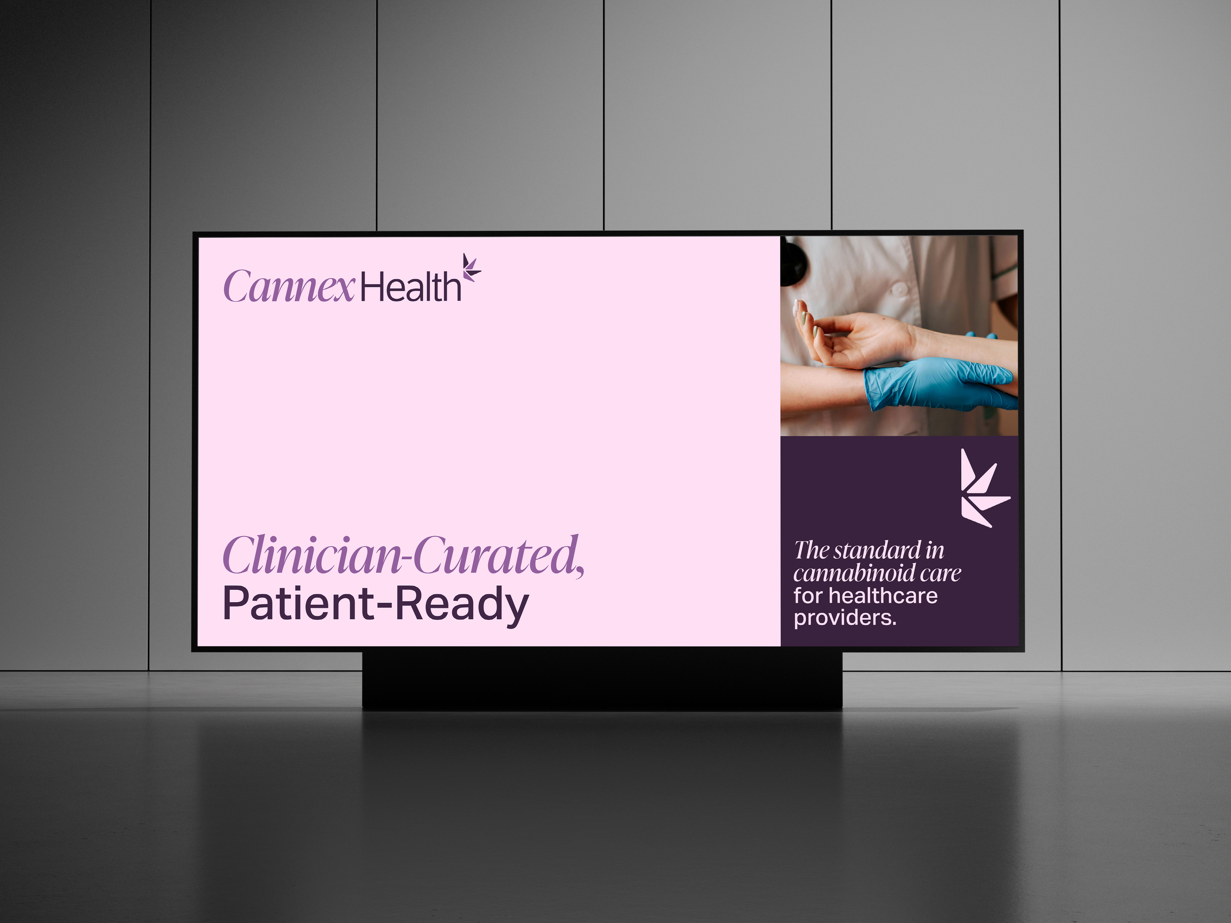
What’s In A Name
“Cannex Health” emerged from this positioning work. The name sits comfortably in a clinical environment—confident but not showy. “Cannex” offers a clear nod to cannabinoids, while sounding technical and concise. “Health” roots the name in the provider space, suggesting a brand that exists not for consumers, but for clinicians. It feels professional, reliable, and scalable—able to grow into a product line, research platform, or educational hub without losing integrity.
IDENTITY & EXPRESSION
Professional, Human, and Designed for Trust
identity work was built on a clear strategy: ditch the patchouli and pot leaves, and make something that professionals would actually trust. We deliberately rejected the crunchy, Eastern-adjacent, or stoner-adjacent tropes that dominate the CBD space.
This brand needed to sit comfortably next to hospital systems and clinical-grade labs—not health food stores or dispensaries. Every visual choice—type, color, photography, tone—was sharpened to cut through skepticism and land squarely in the hands of providers who’ve seen it all. The result is quietly authoritative, clean without being cold, and deeply rooted in the reality of clinical care.
Logo + Visual Identity
Our logo system balances modern science with traditional medicine. The mark combines a serif and sans-serif—representing the duality of research and practice, of data and human care. The monogram (C/H) can flex into a secondary mark for packaging and digital use, while the icon subtly nods to the plant’s origins without leaning into cannabis clichés.


Color & Typography

We steered away from the “crunchy granola” or overly sterile aesthetics of other supplement brands. Instead, we introduced a crisp, fresh palette with cool medical whites, deep navy accents, and warm highlights.
Paired with an editorial sans and a refined serif, the typography system brings clarity with authority.

Photography &
Art Direction
Our photography strategy reframed the audience: instead of centering product, we centered the practitioner. Imagery depicts real-world use—clinicians with patients, tools of the trade, quiet moments of focus. The goal was to create a brand that felt familiar, aspirational, and grounded in professional reality.
To evoke clinical calm without sterility, we leaned on textures that feel like warm glass, soft light, and refined materials. These sensory cues convey safety, clarity, and integrity—everything the CBD category has traditionally lacked.


DIGITAL EXPERIENCE
Built to Educate,
Designed for Confidence.
The Cannex Health site isn’t just an online store—it’s a full-service platform for clinicians looking to incorporate CBD into their practice with confidence.
The site is gated, available only to verified health and wellness professionals. This allows us to tailor language, navigation, and tools specifically to their needs, without needing to simplify or generalize for mass-market audiences.

Solution-First Navigation
Practitioners can explore Cannex by condition (e.g. pain, anxiety, sleep) or by specialty (e.g. physical therapy, mental health, general practice). This isn’t just a convenience—it’s a reflection to show them we understand their actual work and client needs. From the structure of the site to the language we use, everything is built to mirror each provider’s day-to-day reality.


We wanted practitioners to see themselves in this platform, to feel that this was made by people who understand their needs, their challenges, and the way they deliver care—not by a generic wellness retailer chasing trends.
Education
Driven
Cannex is education-first—and we built every digital touchpoint to reflect that. While exploring the site, practitioners are met with more than just product listings; they’re met with context.
Relevant articles, clinical journal summaries, and peer-reviewed insights are hand-selected and embedded into product collections, solution pages, and product detail pages. Whether the practitioner is browsing by condition or diving deep into a specific SKU, the learning travels with them.
Each educational piece is placed intentionally to enrich understanding, not overwhelm—reinforcing our belief that smarter decisions happen when information meets timing and relevance.

Robust Knowledge Hub

Beyond commerce, the site features an extensive library of research-backed articles, clinical trial summaries, and use-case reports.

It’s more than content—it’s a resource ecosystem designed to make the site a go-to source for ongoing professional learning.

Product Pages That Earn Trust
Each product detail page was built to support clinical decision-making—not just sell a product. We packed them with transparent, comprehensive information practitioners actually need: dosage formats, sourcing details, allergen disclosures, cannabinoid breakdowns, and usage guidance.
But we didn’t stop there. We also built in peer context—featuring quotes and endorsements from other practitioners who recommend or use the product. Each page surfaces hand-curated, context-specific educational content alongside the product—journal entries, clinical research, and relevant articles that align with the solution or practitioner specialty. It’s a blend of transparency, science, and utility that gives every page real clinical weight.
