
Aire | Sparkling Mexican tonic

A product, is not a brand.
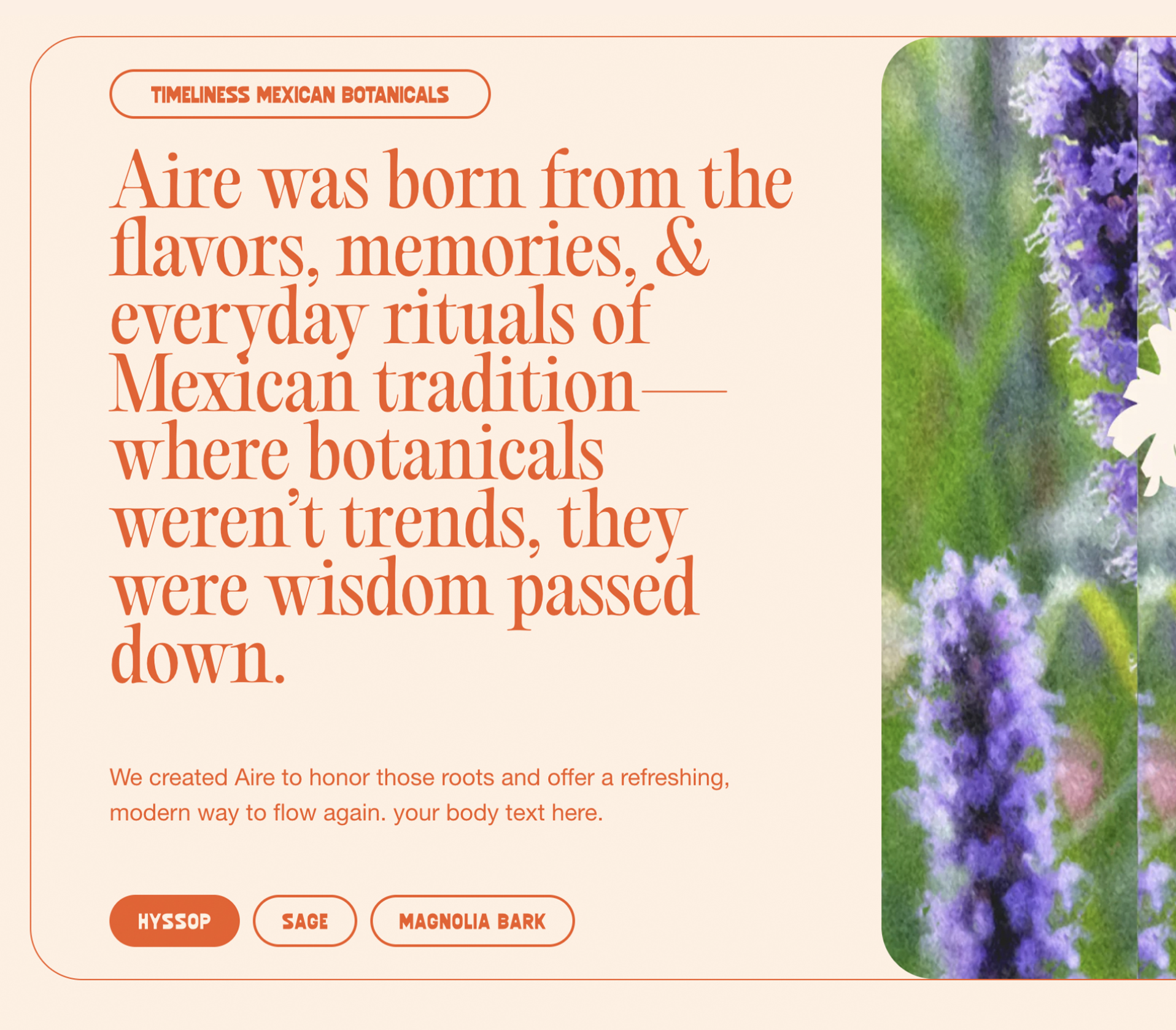
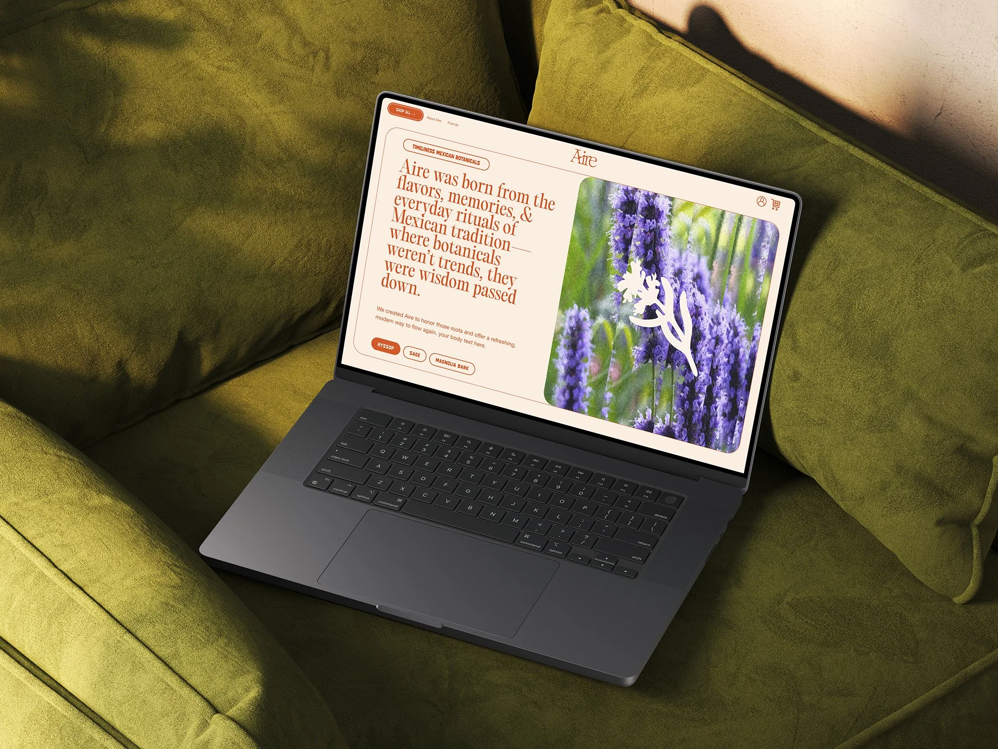
BRAND STORY
Aire showed up with packaging and a logo. Beautiful cans. Flavors that actually taste like something. A founding story rooted in real life—cancer, sobriety, a bottle shop in Chicago, and a gap in the market nobody was filling.
What they didn't have was the connective tissue. The narrative architecture. The digital infrastructure that turns a product into a world.
Toma Aire
The name means "drink air" in Spanish. But the deeper translation is what matters: take a breath. Pause. Come back to yourself.
Aire isn't about escaping the moment—it's about meeting it. No wellness theater, no adaptogen buzzwords. Just a small ritual that helps you flow again. Not with a jolt. With balance.
Expanding the Visual Language — the packaging had a point of view, our job was to turn that into a system.
Clean, legible typography layered against rich Mexican textures. Bold editorial type on top of woven patterns, sun-faded botanicals, tactile surfaces that feel handmade. Modern restraint meets ancestral warmth.
Every layout tells two stories at once. One layer informs—what this is, why it matters. The other immerses—where it comes from, how it feels. A modular system built to scale without losing soul.
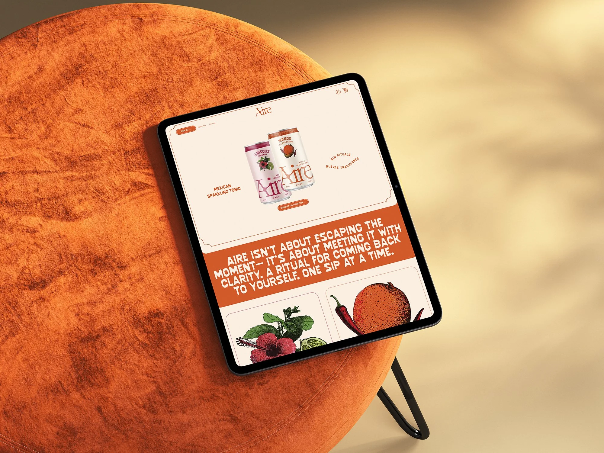
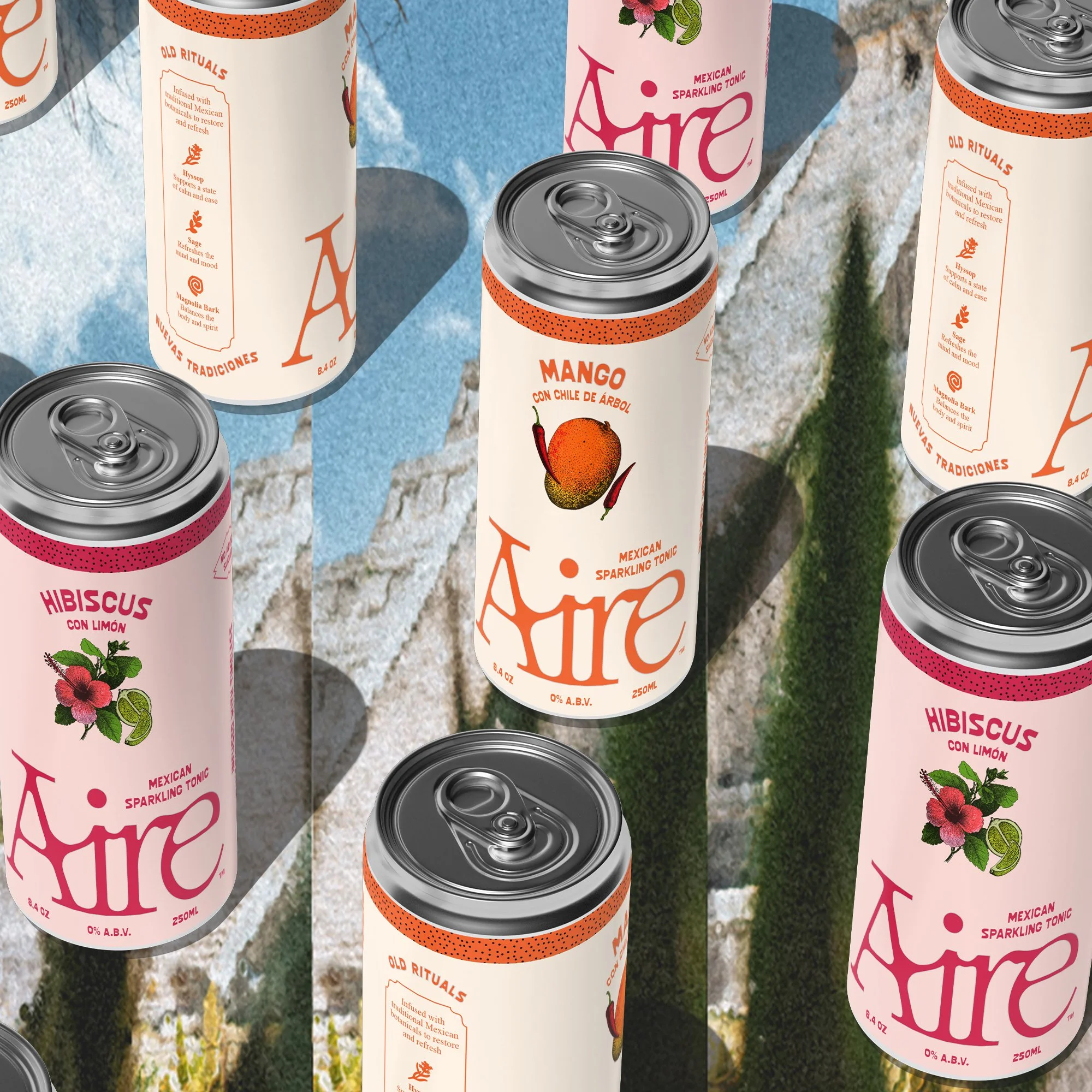
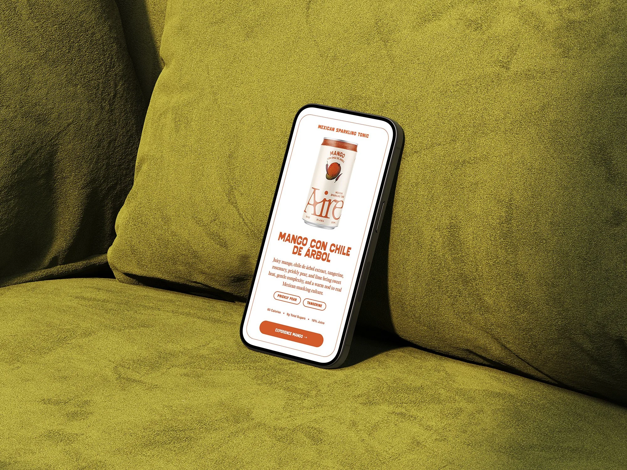
MEXICAN SPARKLING TONIC
We gave Aire a category it could own. Not "functional beverage." Not "NA alternative."
Mexican Sparkling Tonic.
Ingredients don't sell drinks. Feelings do.
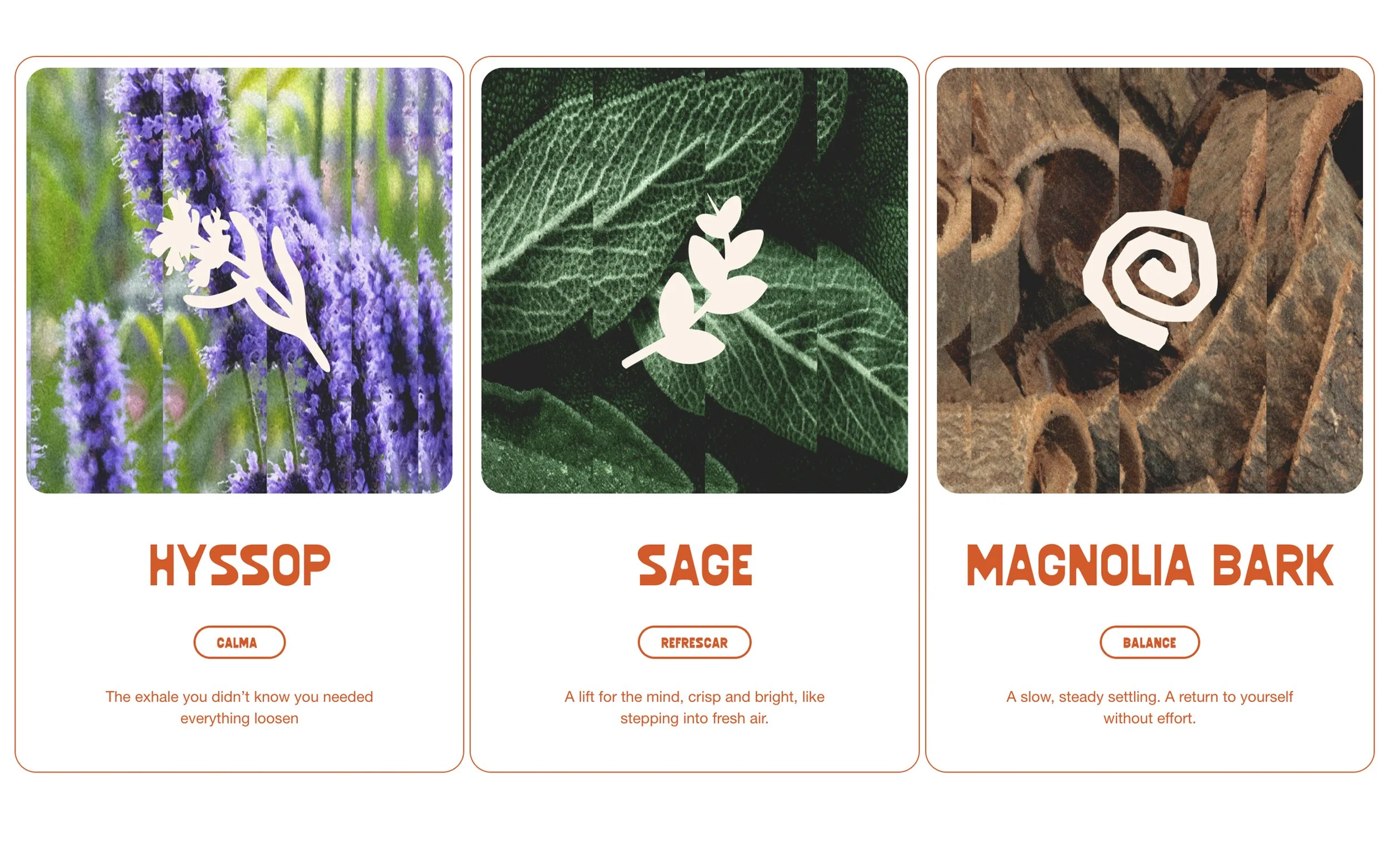
We gave each botanical its own mood, its own story, its own reason to exist in your life. Hyssop became the exhale you didn't know you needed. Sage became the clarity of stepping into fresh air. Magnolia Bark became the slow settling back into yourself.
These aren't supplement facts. They're entry points into the brand world—ways to connect the functional to the emotional, the ancient to the everyday.
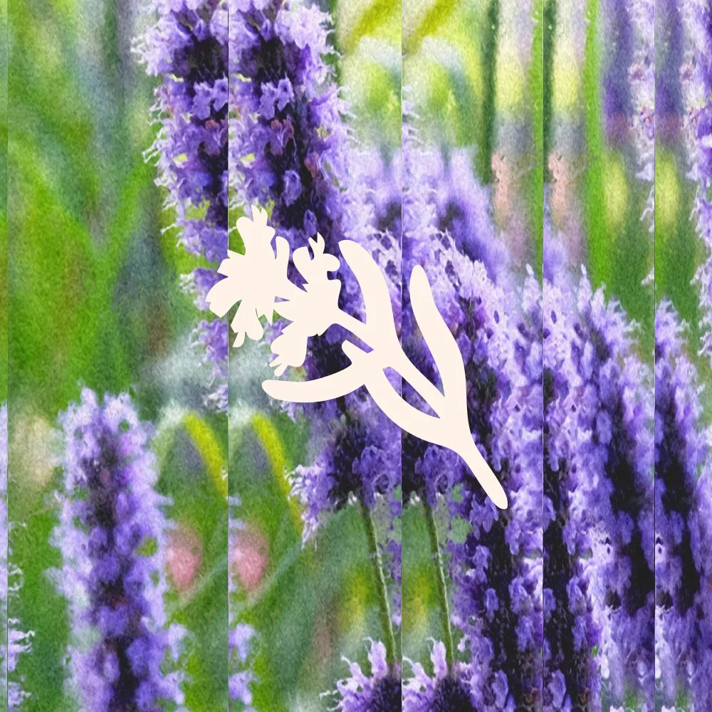
MAGNOLIA BARK | To return to our breath.
HYSSOP | To release what we're holding.
SAGE | To reconnect with others.
Three words that do more work than a deck full of positioning statements. The botanicals—Hyssop, Sage, Magnolia Bark—aren't trendy supplements. They're timeless Mexican ingredients used for generations. We just made sure that story could be heard.
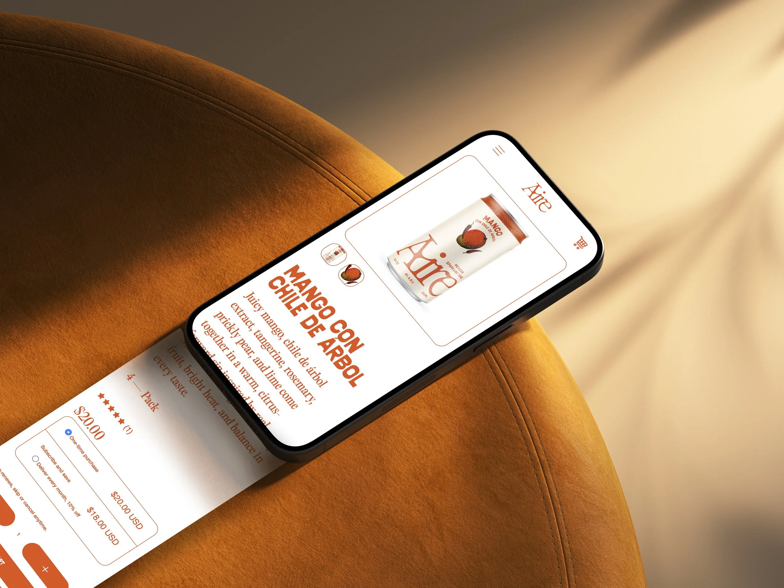
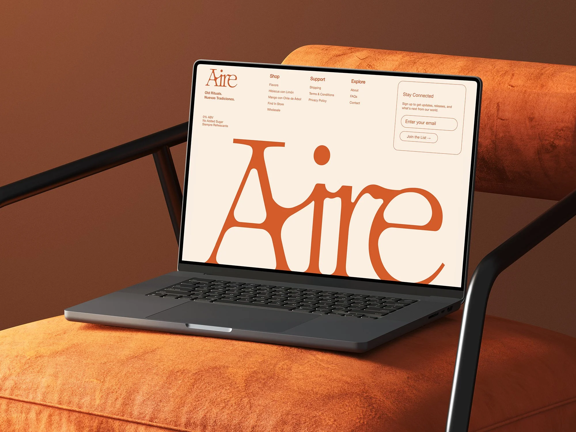
A Site That Holds
Most CPG sites treat heritage like decoration.
We treated it like structure.
Oversized typography that earns its space. Sun-baked color. Texture that feels printed and collaged. The site doesn't explain Mexican tradition—it embodies it. No shouting. Just presence.
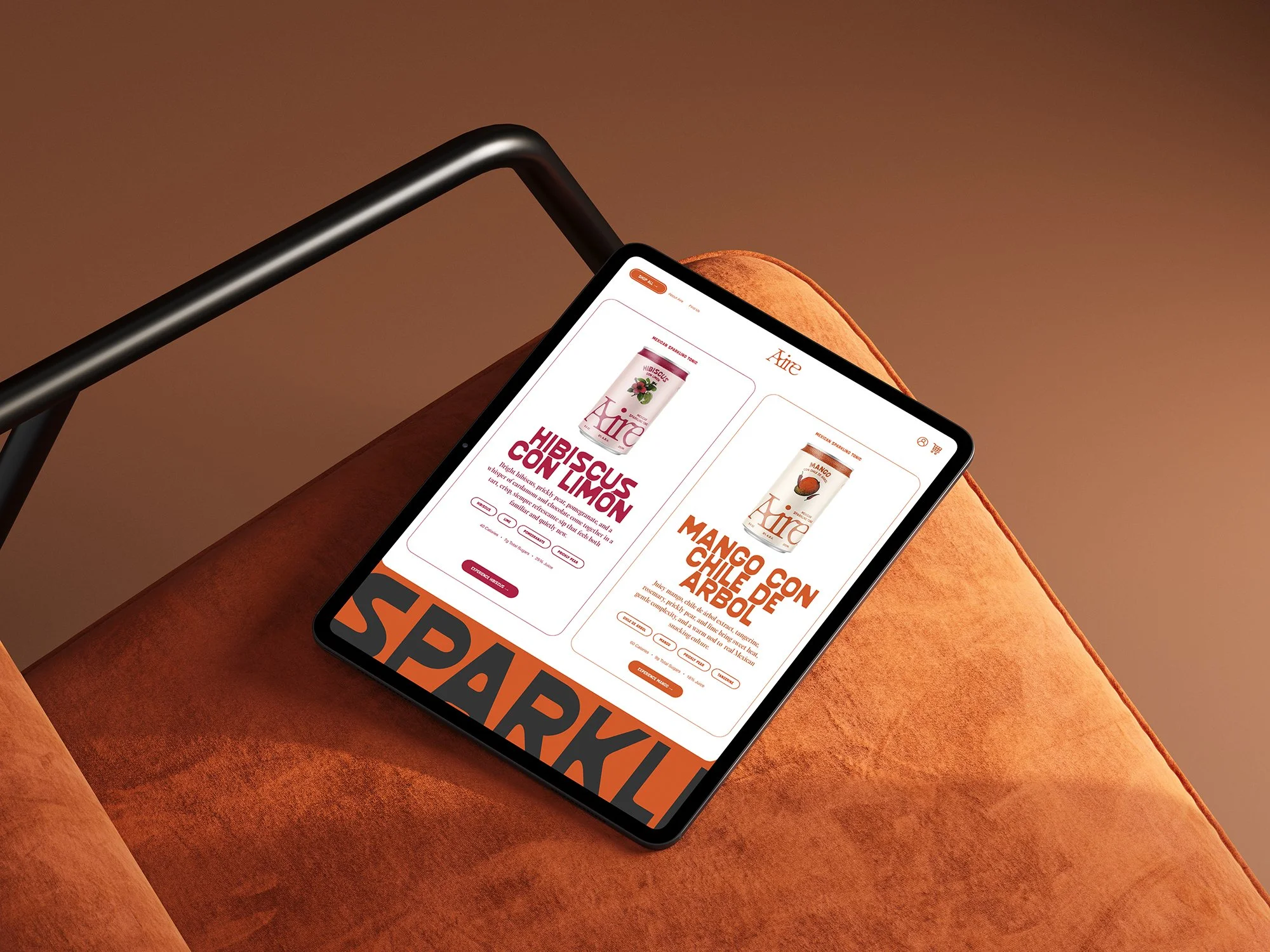
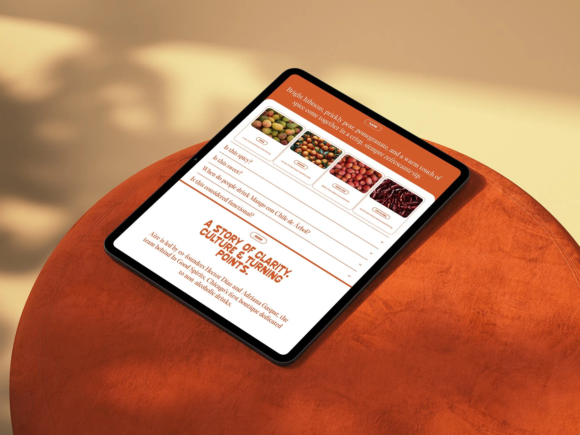
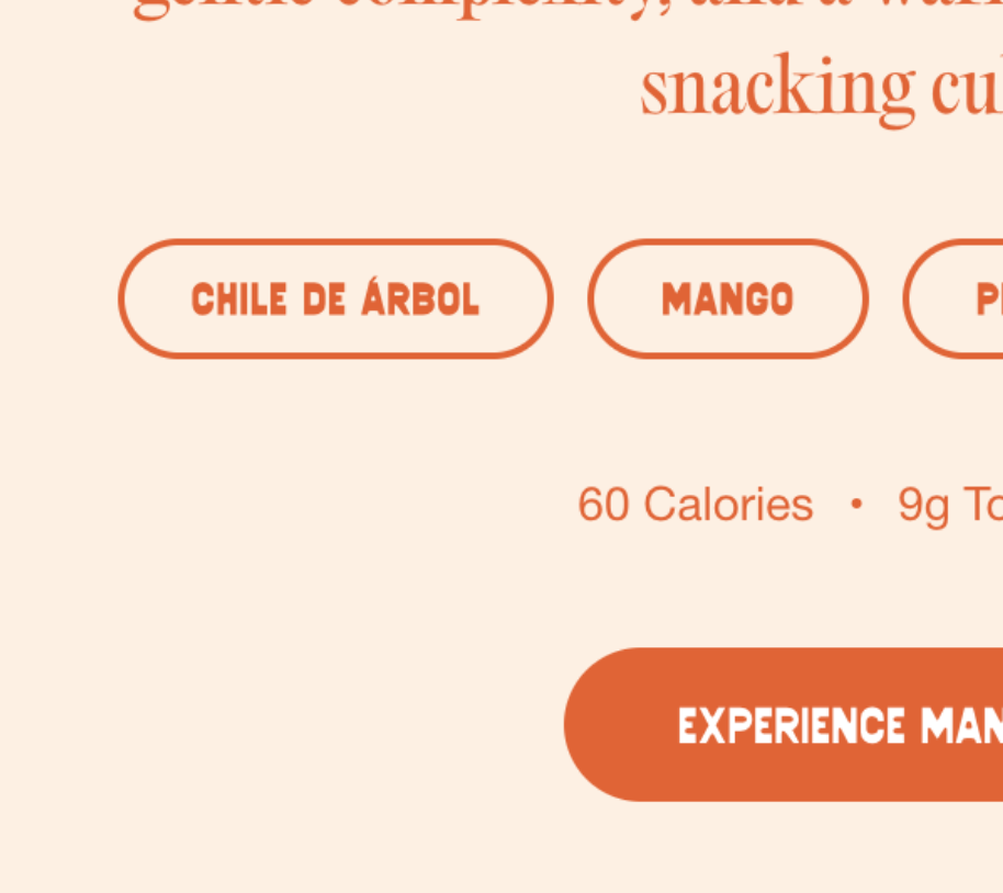
Flavor as Narrative
Most brands treat flavor like a SKU dropdown. Aire treats it like a scene.
Hibiscus con Limón takes you to the agua de jamaica you grew up with. Mango con Chile de Árbol puts you at the fruit stand. This is the difference between ingredients listed and ingredients felt.
THE SYSTEM
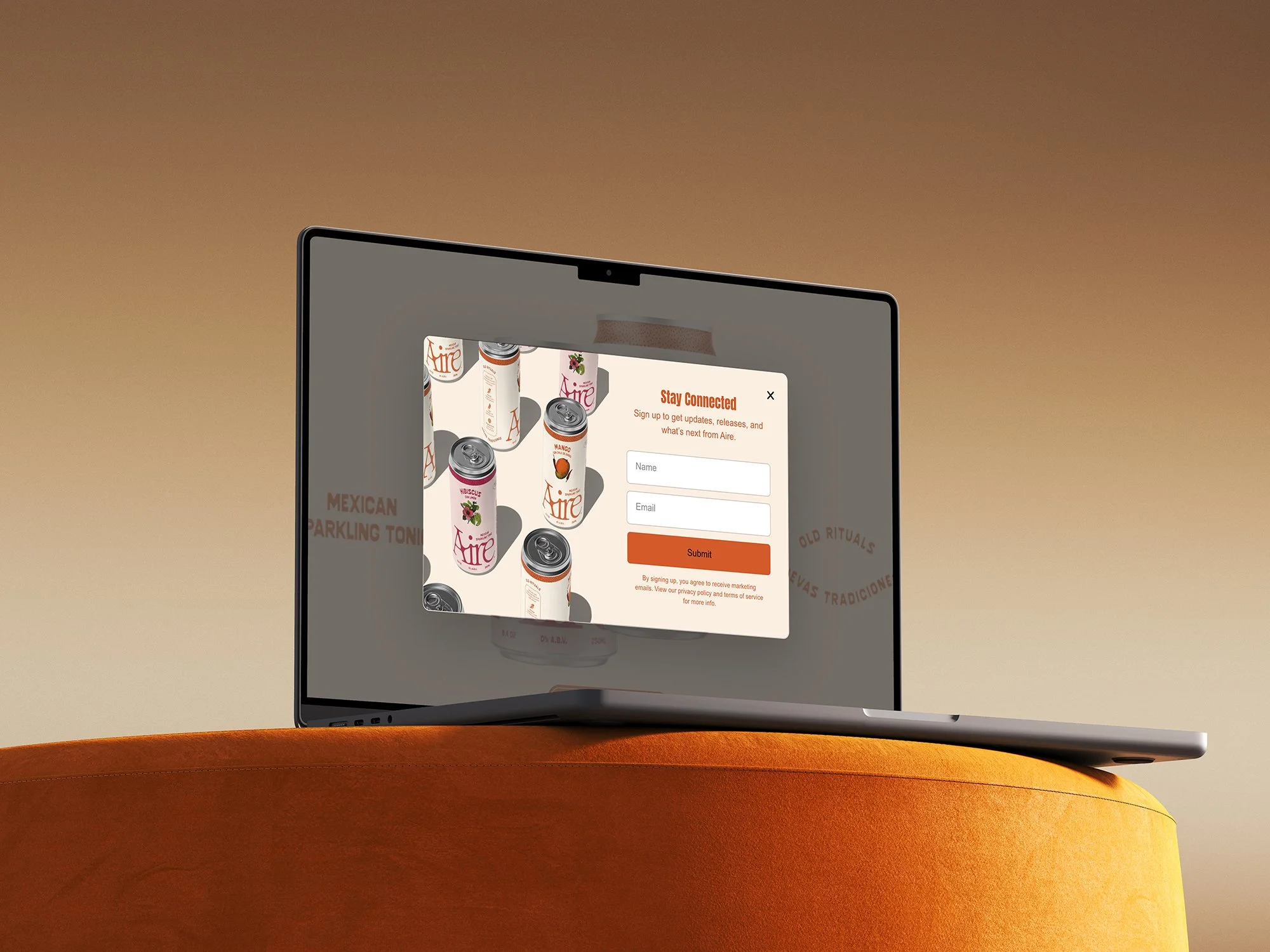
Commerce Without Compromise
A beautiful site that doesn't convert is just art direction. We built retention loops, lifecycle capture, and subscription mechanics—without turning the brand into a spreadsheet.
Subscriptions are the ritual on repeat. Email capture feels like joining something, not getting cornered. Wholesale access feels like a front door, not a side entrance.