The Future of E-Comm UX: Kill Your Bloated Funnels
Your plug-in packed Shopify site is an endless funnel—a bloated, boring mess made worse by endless thumbnails and nav menus no one asked for.
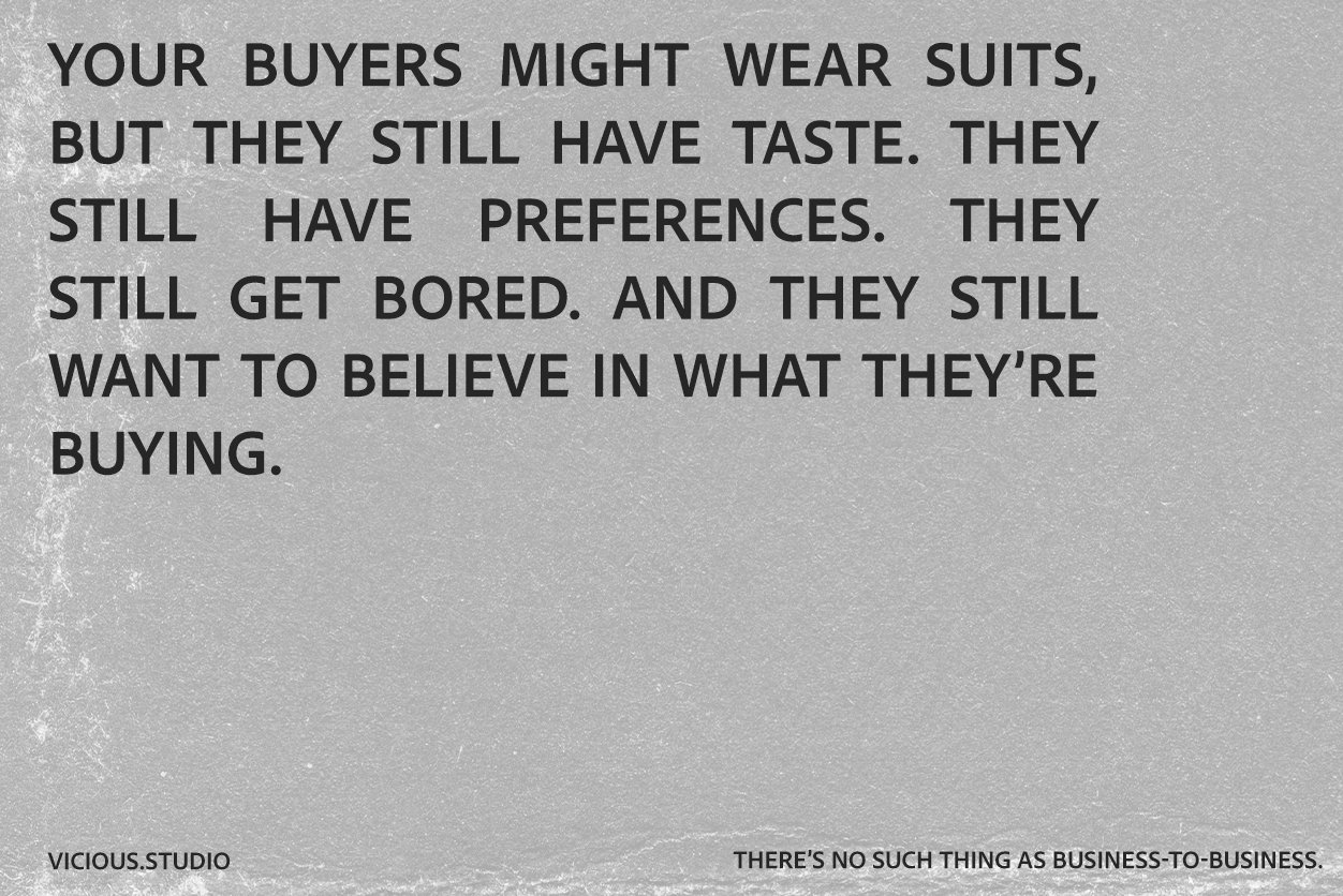
Really, you are not representing your brand, or even your products here…all you are showing us is that you used some outdated marketing DTC tired playbook, optimized for Google, not humans.
Mobile changed everything. Your users already know you from Instagram or TikTok— this is mostly the side door they are coming from anyways…
They're here to shop, not dig. Get the product in their hands immediately (they're on mobile.. So you are literally in their hands… make it feel like your product is literally in their hands. Remove all the annoying steps and make it feel like they are holding your brand, your products in their hands.
Skip traditional navigation, kill hierarchy, show shoppable products upfront. Flat, actionable UX is the future—brands that get this will dominate.
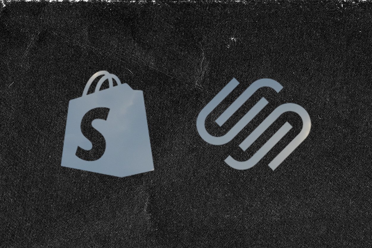
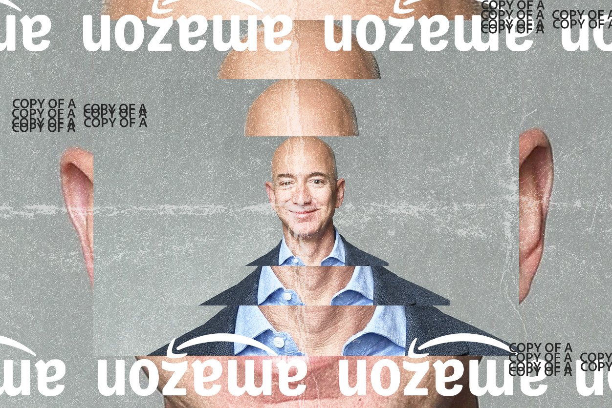
Traditional e-commerce UX is dead. You've seen it: Shopify stores stacked with plug-ins, endless "features," social integrations, bloated landing pages, and stale thumbnails marching customers down outdated marketing funnels. It's bad UX, driven by marketing obsession rather than brand thinking. Your website isn't your brand anymore—it's a collection of clichés optimized for outdated SEO. Your users deserve better.
Here's a radical truth: real branding combined with bold UX moves product faster. Good UX doesn't funnel—it shortcuts. Today, customers don't find you through a homepage; they come via social or direct links. They know your story already. Stop drowning them in repetitive context. Make their first interaction instantly shoppable.
Let's rethink this.
Kill Traditional Navigation:
Menus packed with links no one cares about—category upon category, summer collections that you can't even shop…. Ditch it. Use flat, product-first navigation. Telfar nails this by showing their products directly within their nav—bags, colors, styles, instantly actionable. Users don't navigate categories—they navigate the actual product — making it one step easier to get that product in their hand.
Shoppable Tiles from the Start:
Product tiles aren't the destination; they're the entry point. Why make users drill into a PDP for basic info like size or color? Dynamic, shoppable tiles with variables and video right on the homepage reduce friction. Make adding to cart easy—right from that first glance.
Interactive Look books as UX:
Gentle Monster's immersive seasonal campaigns set the bar. Shoppable lookbooks aren't just aesthetic—they're functional, actionable interfaces. Users explore, engage, and add products seamlessly within an interactive, brand-rich context.
Mobile First Means UX First:
Everyone experiences your brand on mobile first. Make products feel literally at their fingertips. Stop forcing them through ten screens of narrative. Luxury hotels, for example, should instantly showcase rooms with carousel tiles showing immediate booking options—no bloated brand essays needed.
Your customers already know your brand. They don't want your story—they want your product. Put it in their hands fast, in fewer clicks, with better UX. Kill your grid, destroy your funnels. The brands that win tomorrow are already acting today.
So yeah—kill the funnel. Flatten everything. Bring your products to the front.
Ok, like do what you need to do. Don't mess up your SEO or what ever… I want you to market your site correctly… thats not what I'm getting at. I'm just saying, make the shopping experience feel like an experience that belongs uniquely to your brand.